Nautical Wine Label
Customer: Sailor Wine/ Task: Label design and Illustration
Context
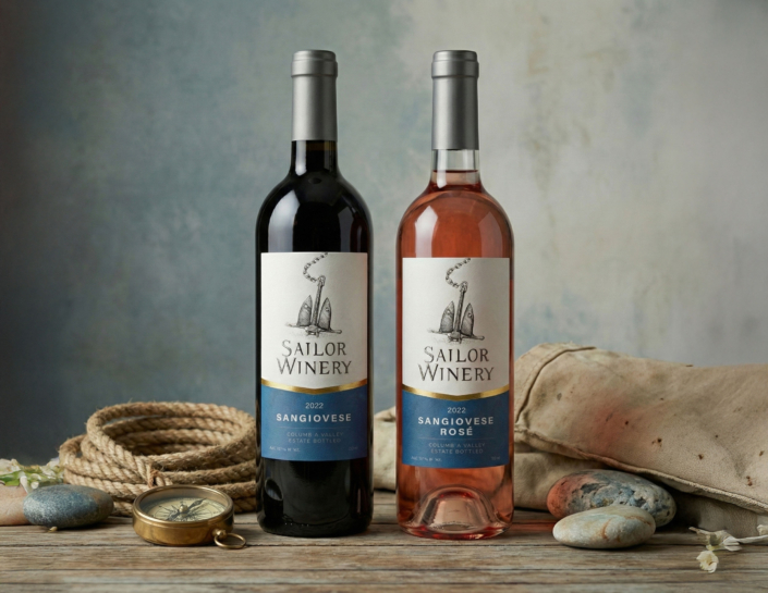
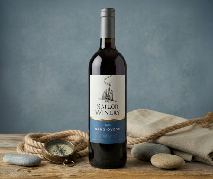
Create a wine label for Sailor Winery for red and rosé Sangiovese.
The client required an anchor as the core symbol of the label.
The label had to be clear, restrained, and suitable for real production and photography.
No series was planned — one label with small variations.
Approach
We worked with a simple, vertical composition built around the anchor.
The design was developed directly for the bottle:
-
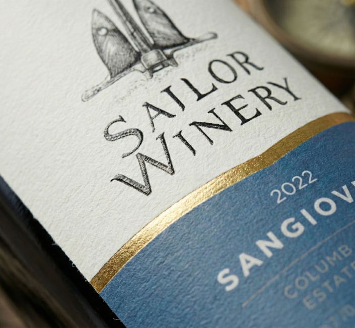
hand-drawn anchor illustration as the main visual element,
-
classic wine label hierarchy for fast reading,
-
focus on balance, contrast, and real shelf presence.
The goal was to add character without adding complexity.
Result
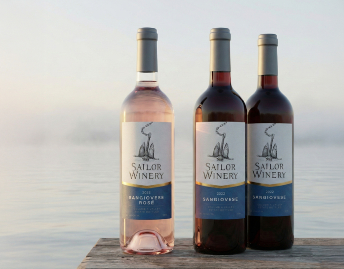
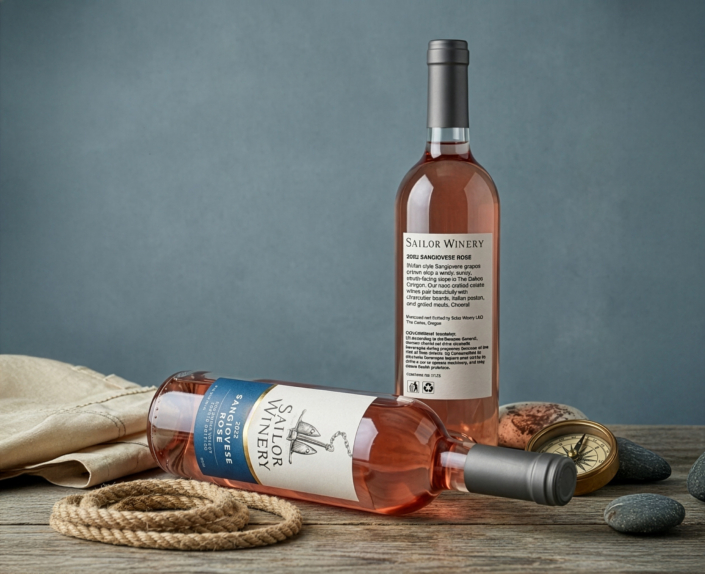
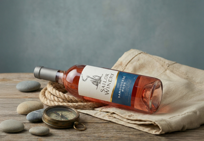
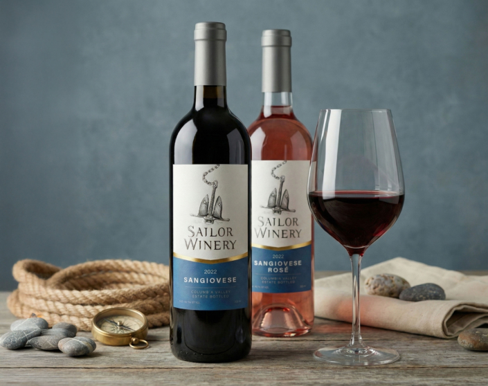
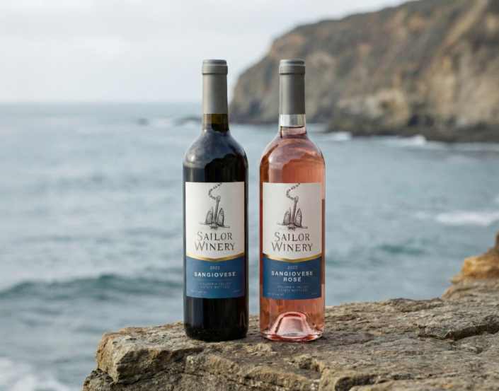
We designed one label, adapted for red and rosé Sangiovese through minimal changes.
What we added as designers:
-
a strong blue bottom block that structures the label and gives it weight on the bottle,
-
an anchor chain breaking the top edge of the label, adding depth and a sense of space,
-
subtle colour variation to separate red and rosé without changing the layout.
The result is a calm, solid label that works in production, on the shelf, and in product photography — without relying on trends or decorative effects.
