Nautical Wine Label
Customer: Sailor Wine/ Task: Label design and Illustration
Context
Sailor Winery
Client: Sailor Winery
Scope: Wine Label Design · Illustration
Context
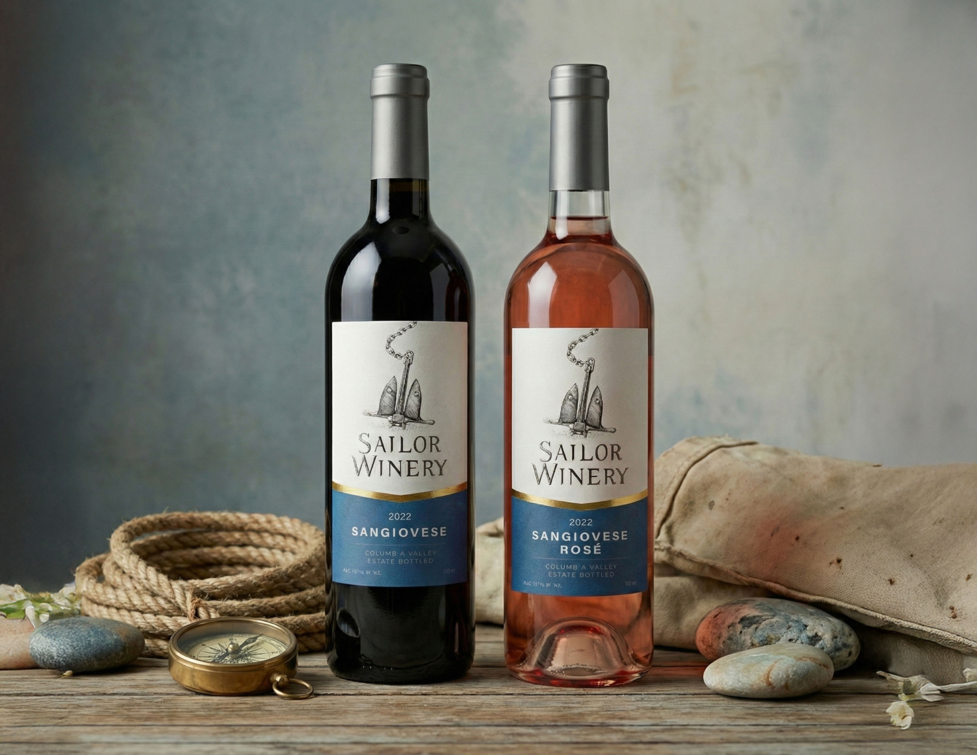
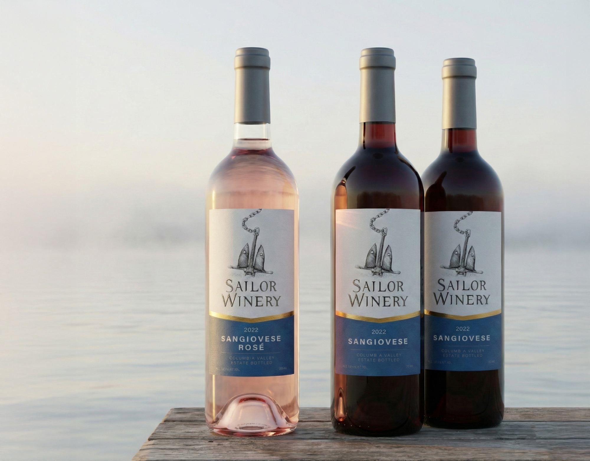
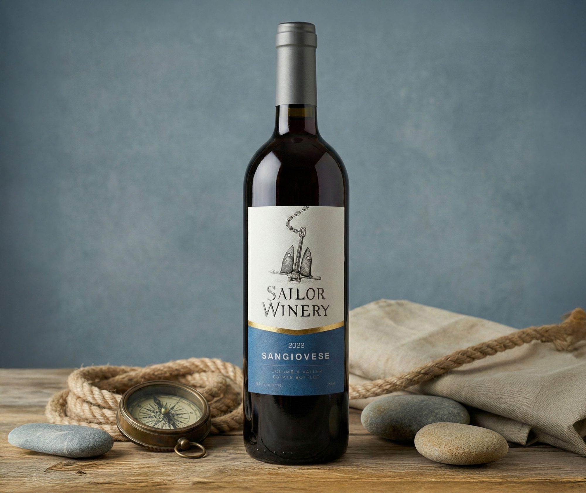
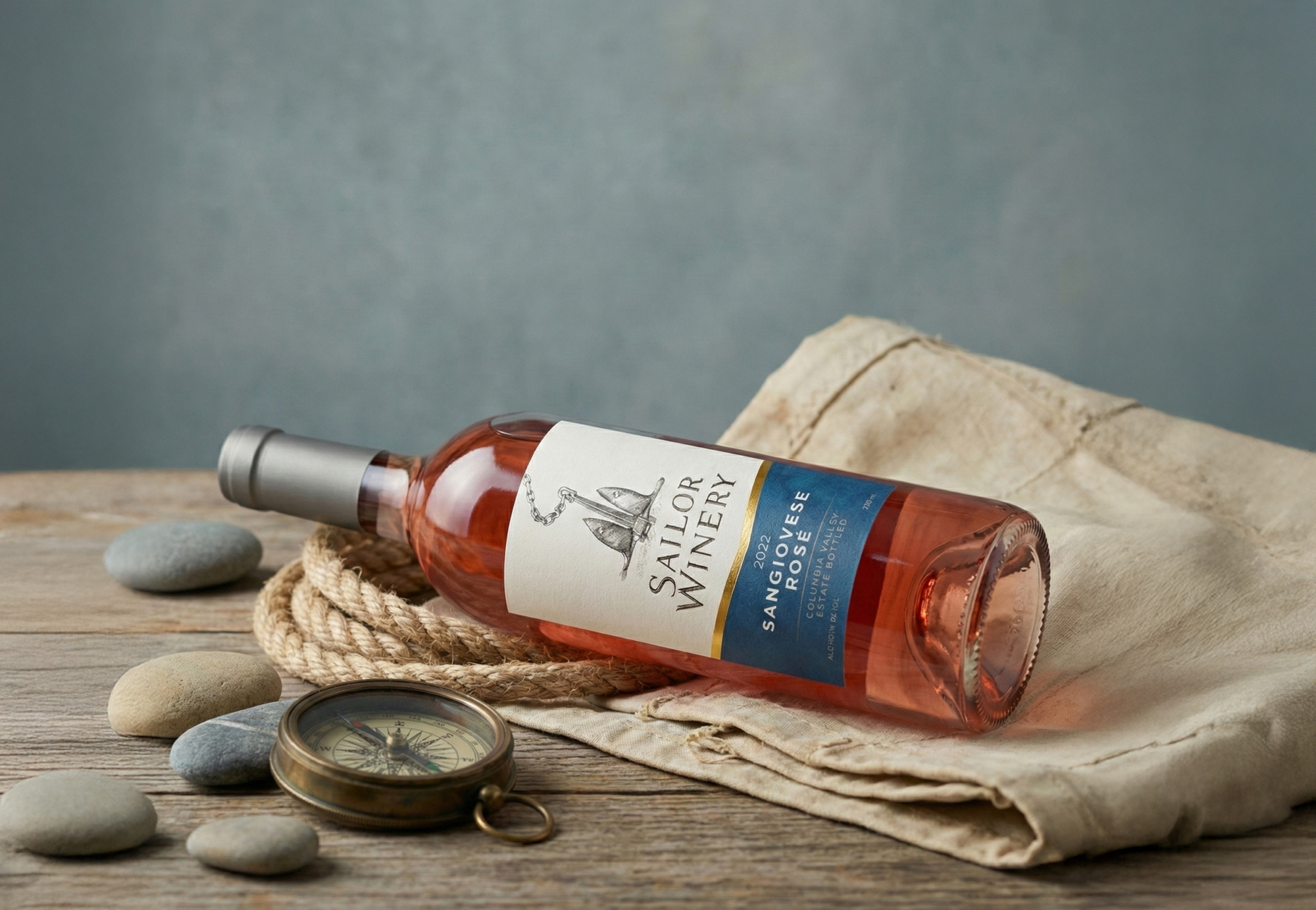
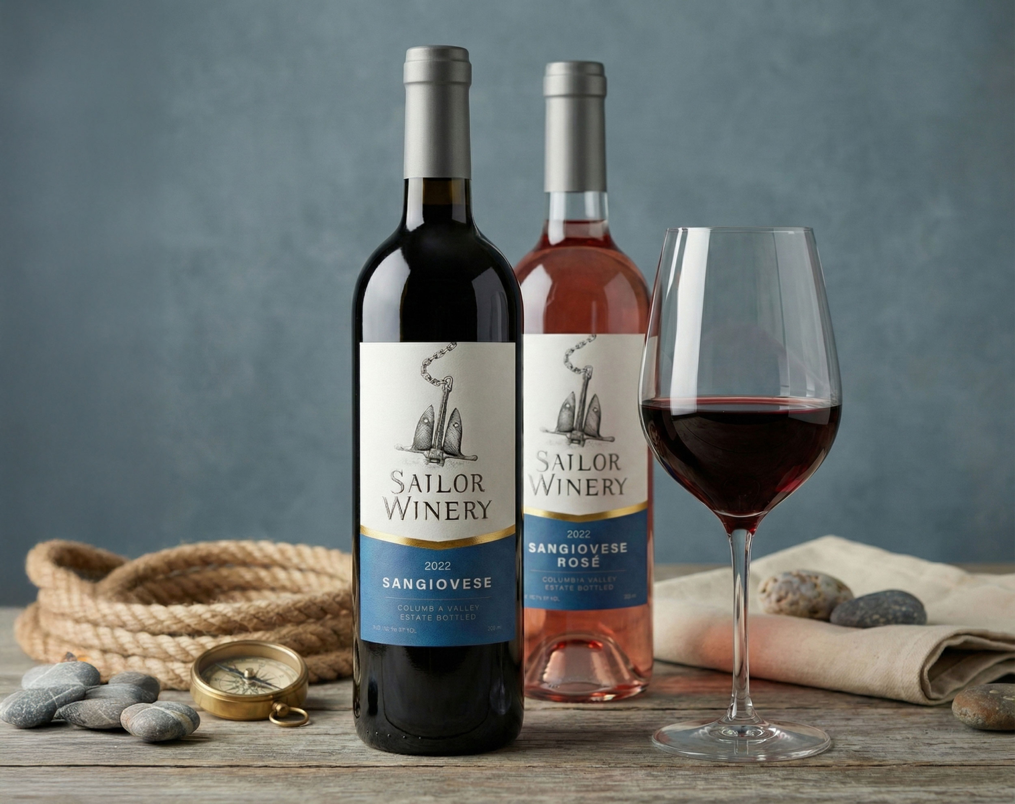
Sailor Winery commissioned a label for its Sangiovese wines, with separate versions for red and rosé.
The brief was intentionally restrained. There was no need for a large product family or an expressive storytelling system—just one elegant label built around a nautical theme. The anchor was the only required visual element.
Approach
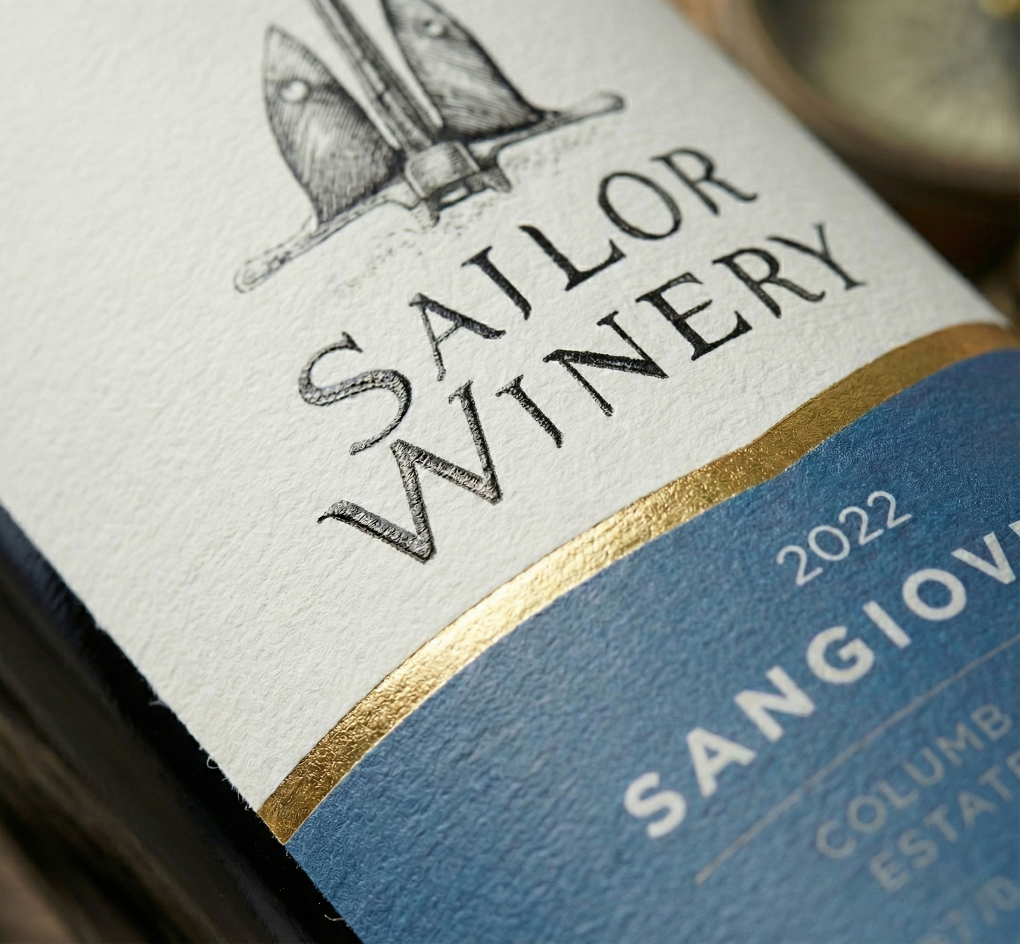
Rather than turning the maritime idea into decoration, I kept the design calm and timeless.
A hand-drawn anchor became the focal point of the composition, while classic typography and generous negative space gave the label a refined, premium feel. To avoid a static layout, I extended the anchor chain beyond the top edge of the label, subtly breaking the frame and adding depth without disturbing the overall simplicity.
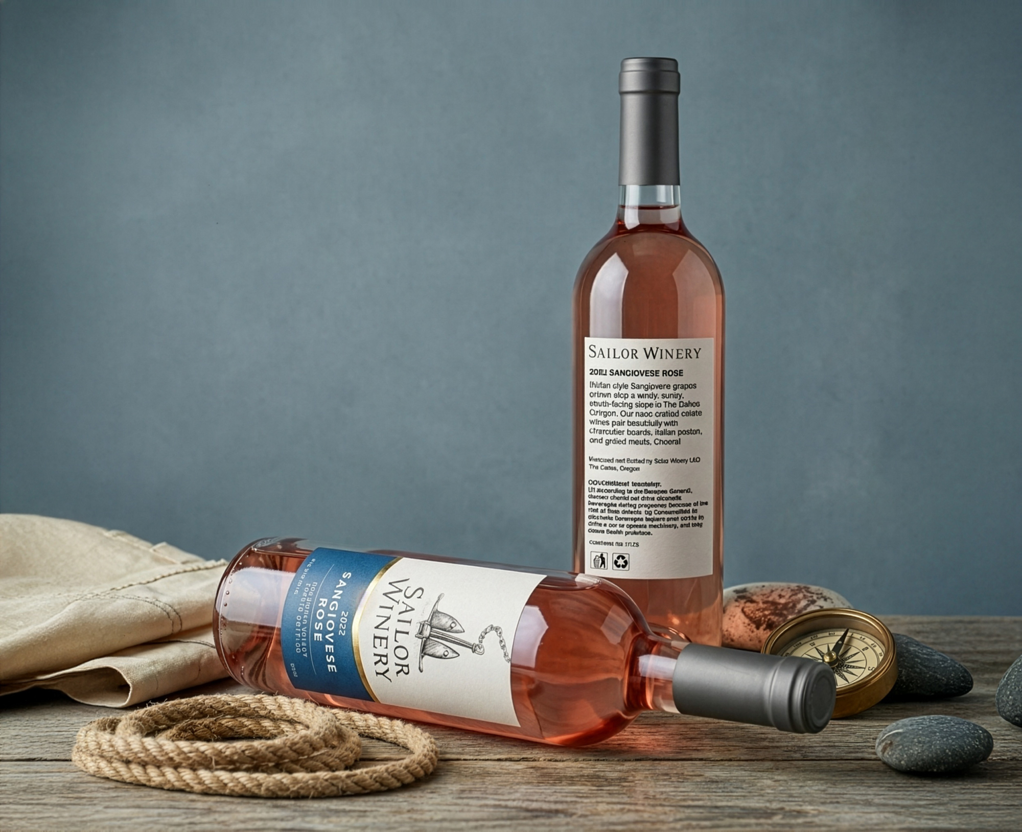
The blue lower section grounds the composition visually, balances the proportions of the bottle, and provides a clear area for the wine information.
Result
The final design proves that a label doesn’t need to be complex to have character.
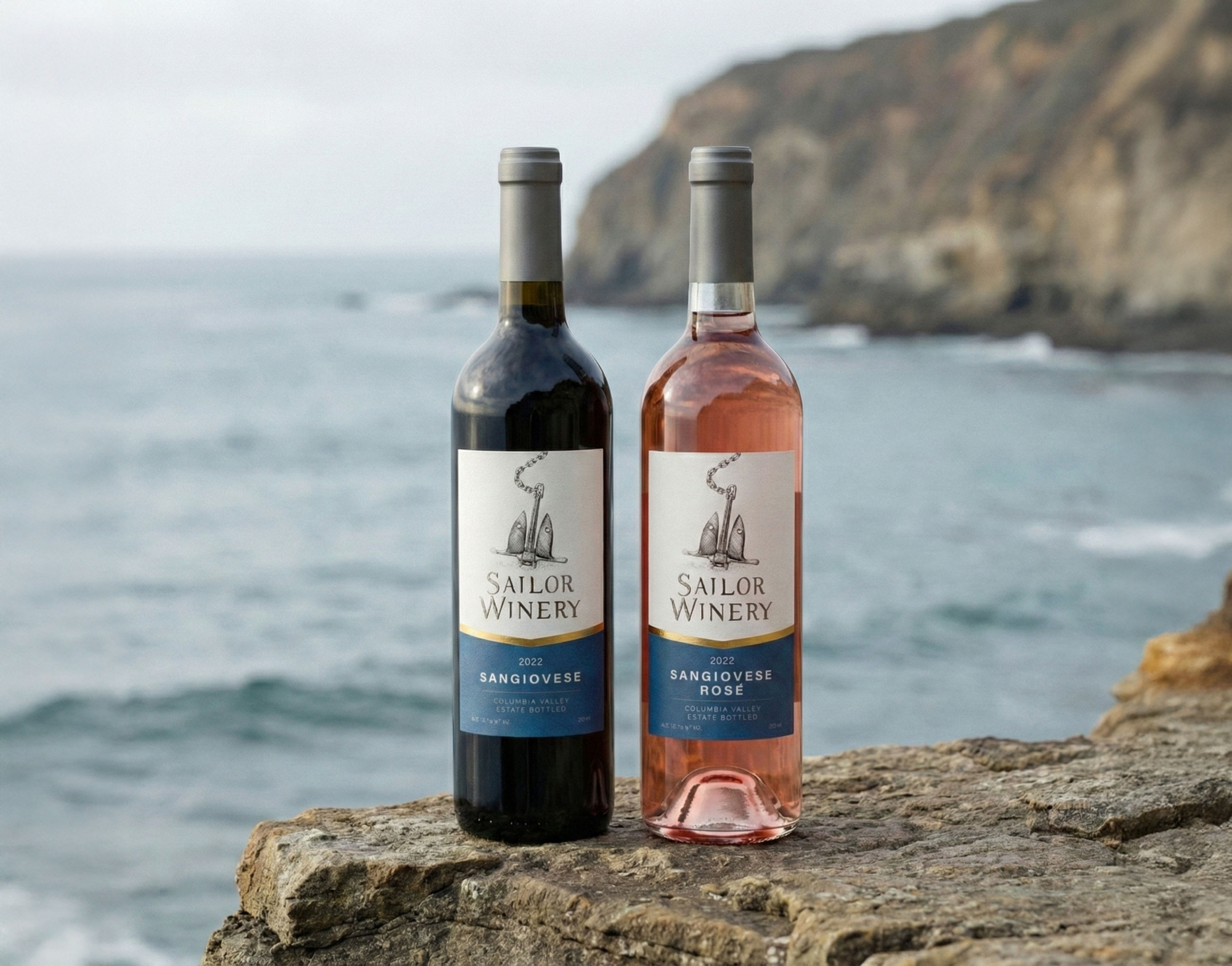
The same visual structure was adapted for both the red and rosé Sangiovese through minimal colour changes, creating consistency while allowing each wine to keep its own identity.
The winery continues to use the label on its wines, demonstrating that thoughtful proportions, restraint, and strong hierarchy can be just as memorable as elaborate graphics.