Offshore Gin Label
Customer: Offshore Gin/ Task: Gin label design and illustration
Description
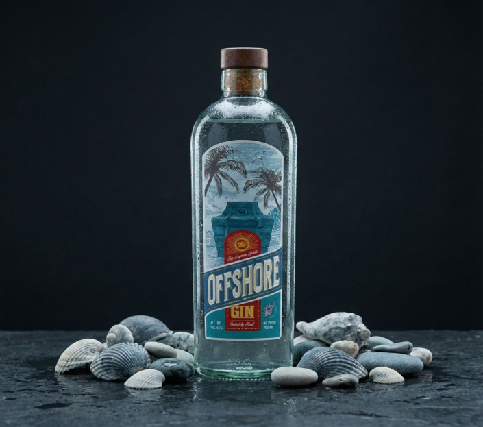
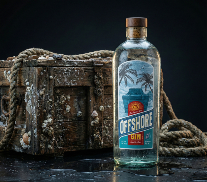
This project explores the idea of a product kept outside the usual system. Offshore Gin is presented as something rare and deliberately hidden — a bottle treated more like a stored object than a mass-market item.
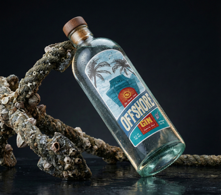
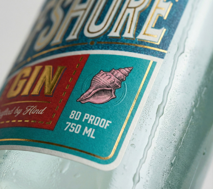
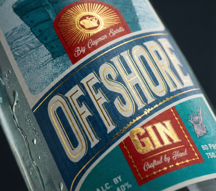
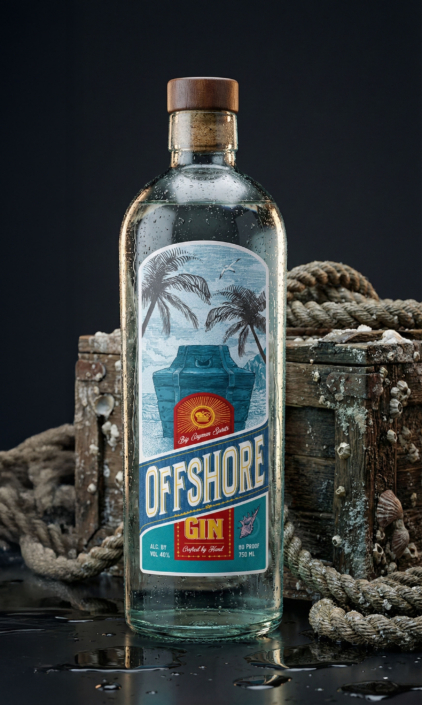
The label design is built around a simple central symbol: a treasure chest. It acts as a clear and readable metaphor for the gin itself — a small batch product that feels discovered rather than promoted. The illustration is detailed but controlled, supported by clean typography and a restrained colour palette. Gold foil is used sparingly to add weight and clarity, not decoration.
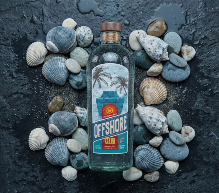
The visual language stays quiet and material-focused. Dark glass, tactile paper, subtle reflections and calm references to the sea create a sense of depth without relying on loud storytelling or obvious themes. The bottle feels solid, intentional, and unforced.
The overall system is designed to work naturally in real settings — on a bar shelf, in a shop, or in the hands of the customer. It positions the gin as something you notice gradually, appreciate through detail, and remember for its character rather than its noise.
