Black Sherwood Forest — Gin Label
Customer: Black Sherwood Lte/ Task: Gin Label Design and Illustration
Description
Black Sherwood Forest
Scope: Gin Label Design · Illustration
Context
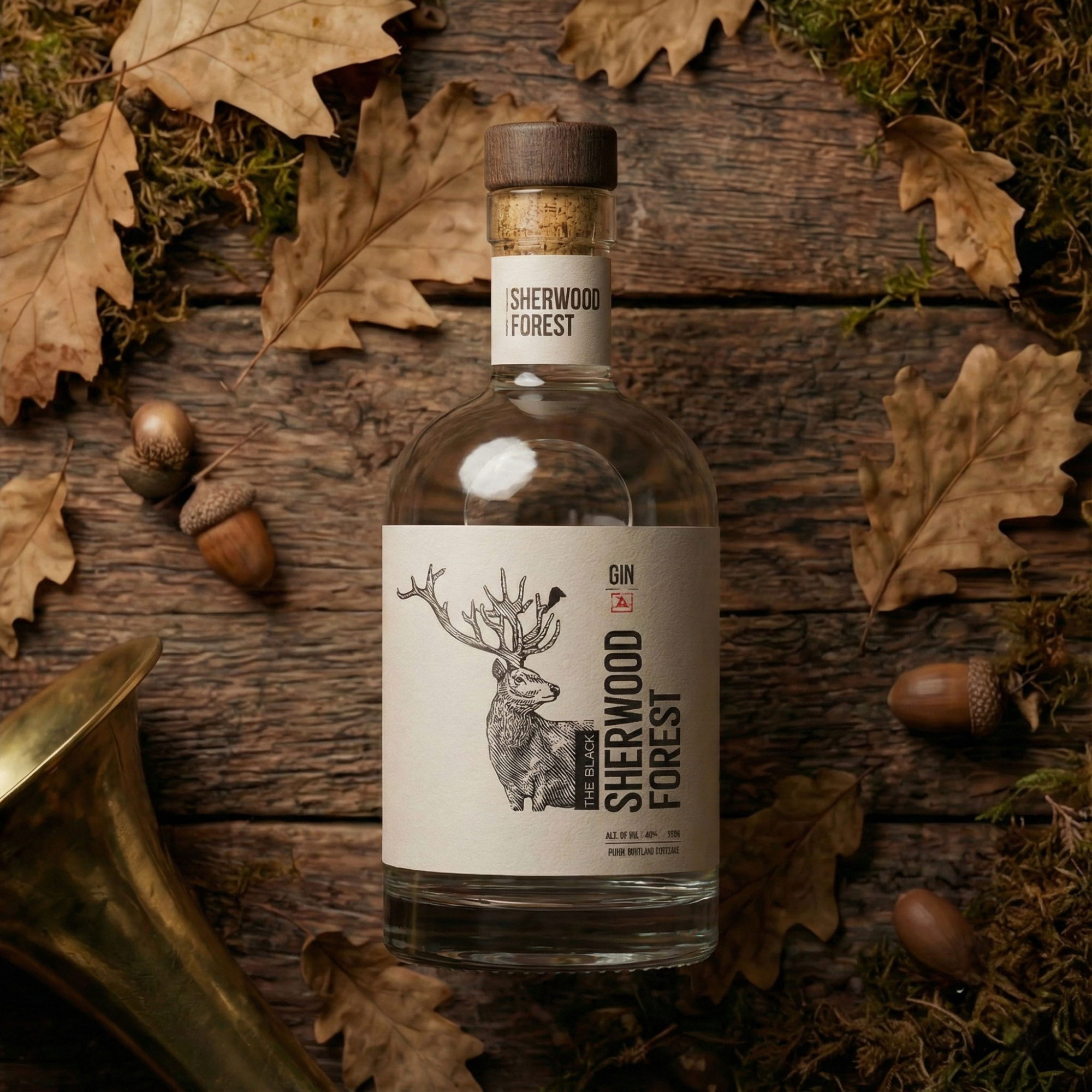
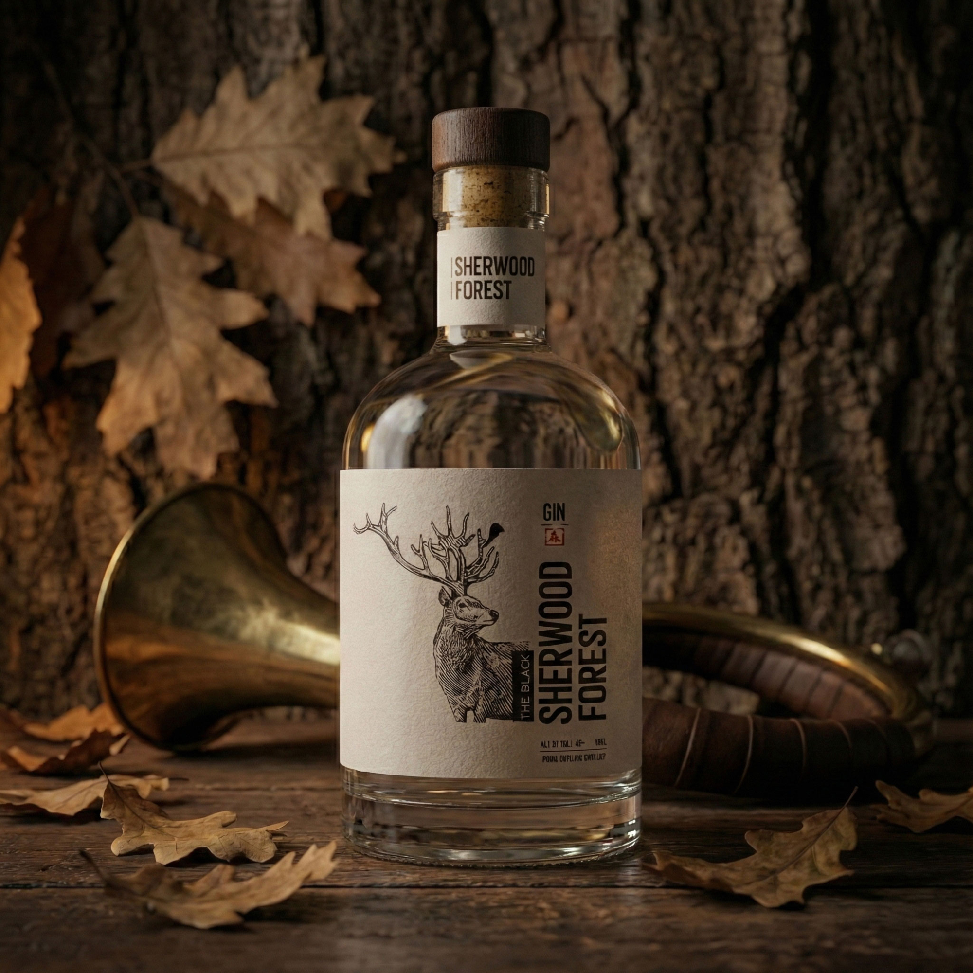
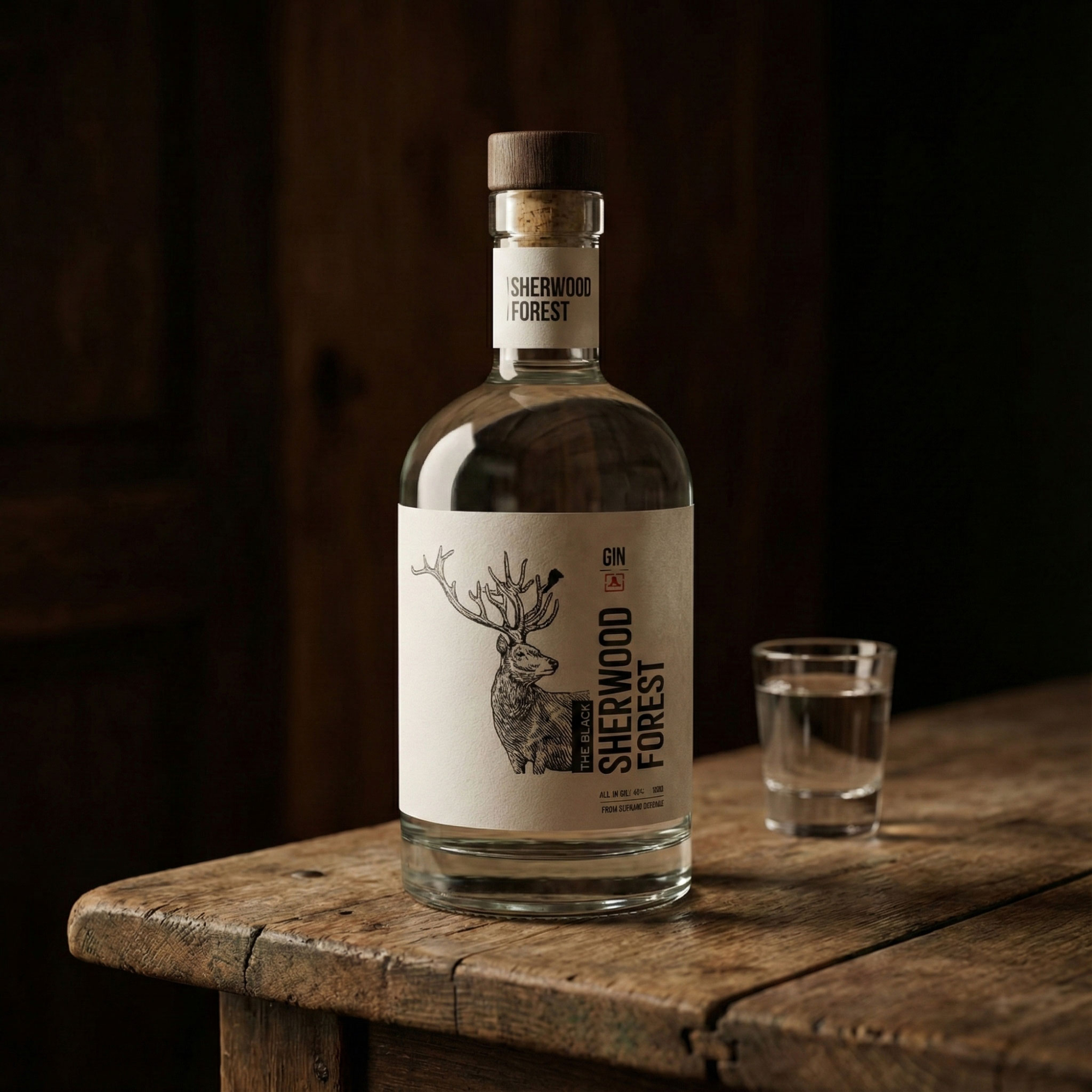
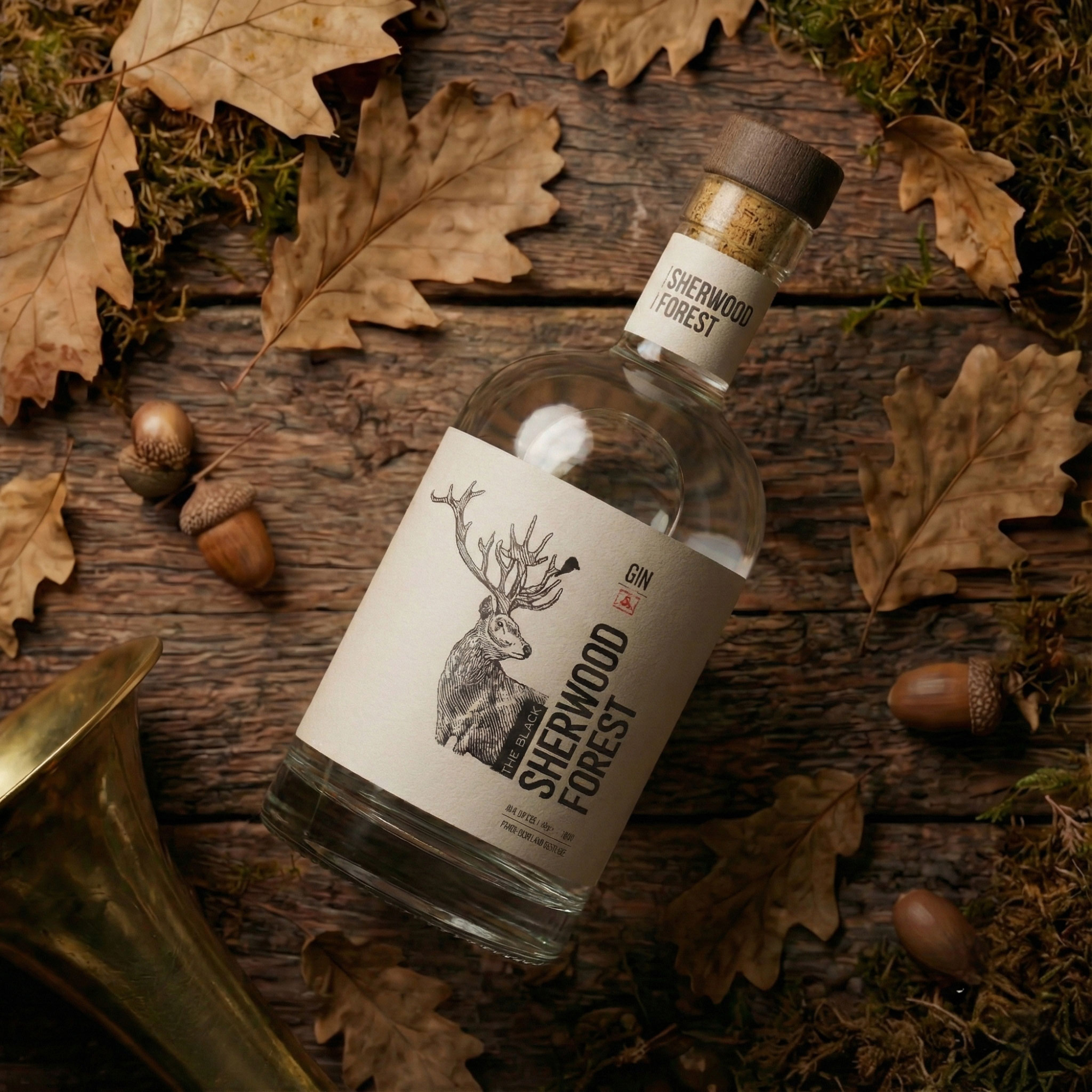
Black Sherwood Forest explores what a local forest gin could feel like if its identity grew from place rather than marketing.
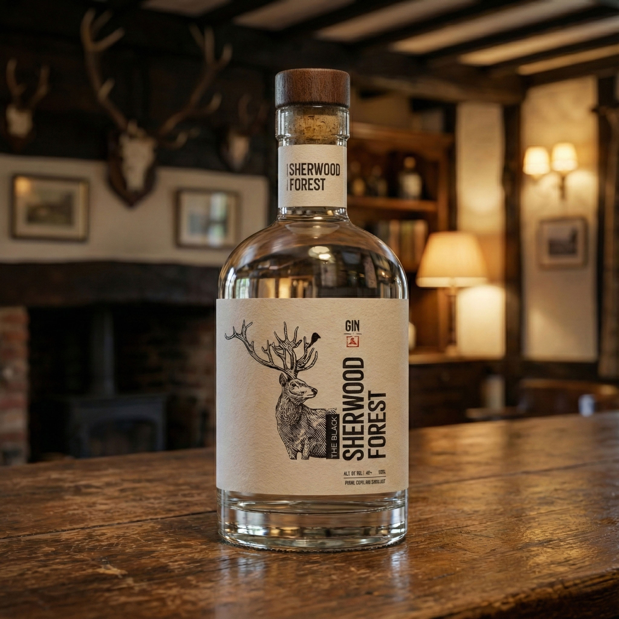
Instead of competing for attention on a retail shelf, the idea was to create a bottle that feels at home in a countryside pub, a small distillery, or a visitor centre—something discovered during a trip rather than advertised from a distance.
Approach
The design is intentionally restrained.
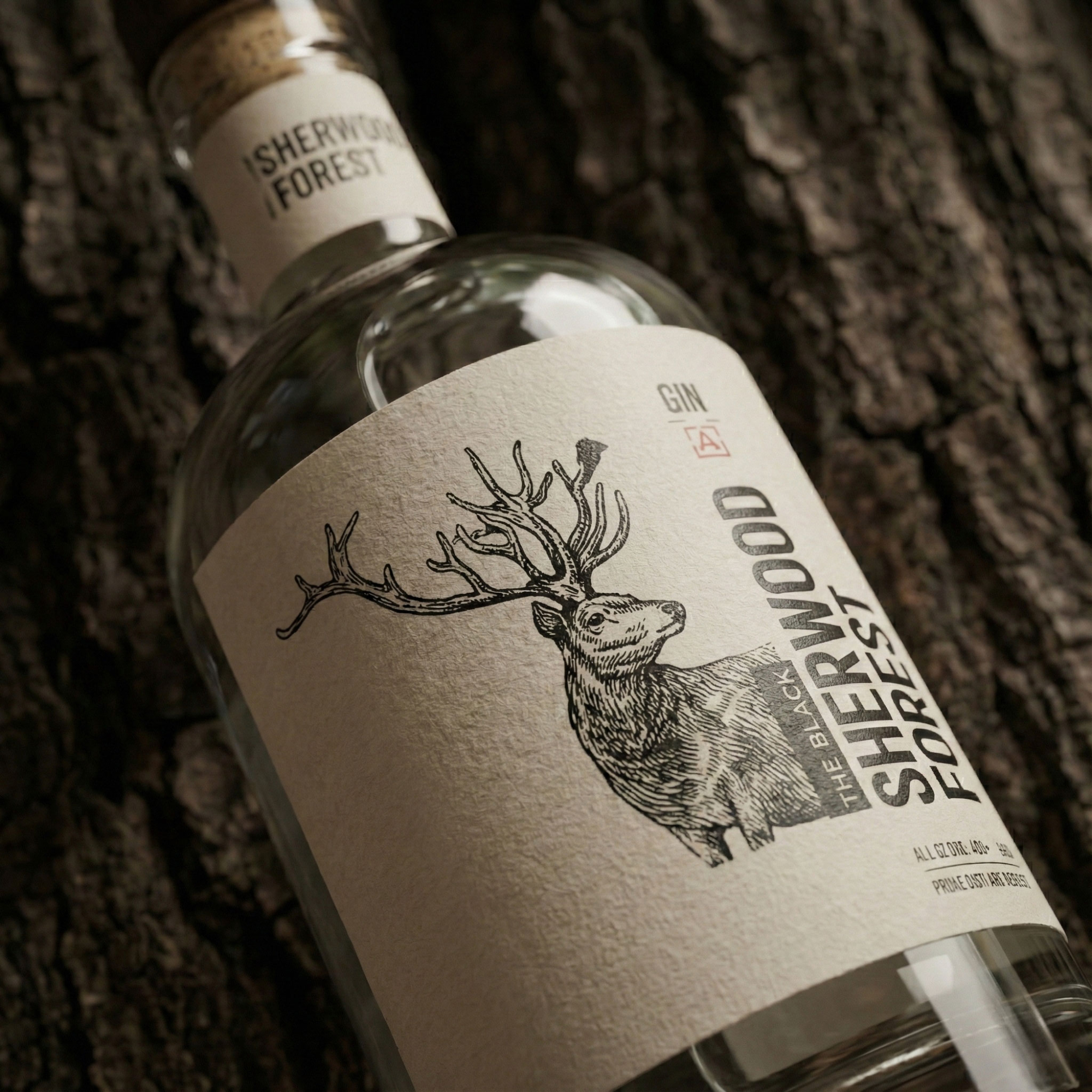
A hand-drawn stag becomes the central symbol, representing the surrounding woodland without turning it into decoration. The typography stays simple and architectural, allowing the illustration and the bottle itself to carry the atmosphere.
The label was imagined on uncoated, tactile paper, where texture becomes part of the experience. Rather than relying on bright colours or visual effects, the design uses proportion, material, and negative space to create a quiet premium presence.
Result
The final concept shows another side of my approach to packaging design.
Sometimes the strongest identity isn’t built through louder graphics—it comes from restraint, material quality, and a clear sense of place.
The bottle is designed to feel discovered rather than advertised, creating an experience that stays with people long after they’ve left the forest.