Borealis Coffee — Packaging and Key Visual
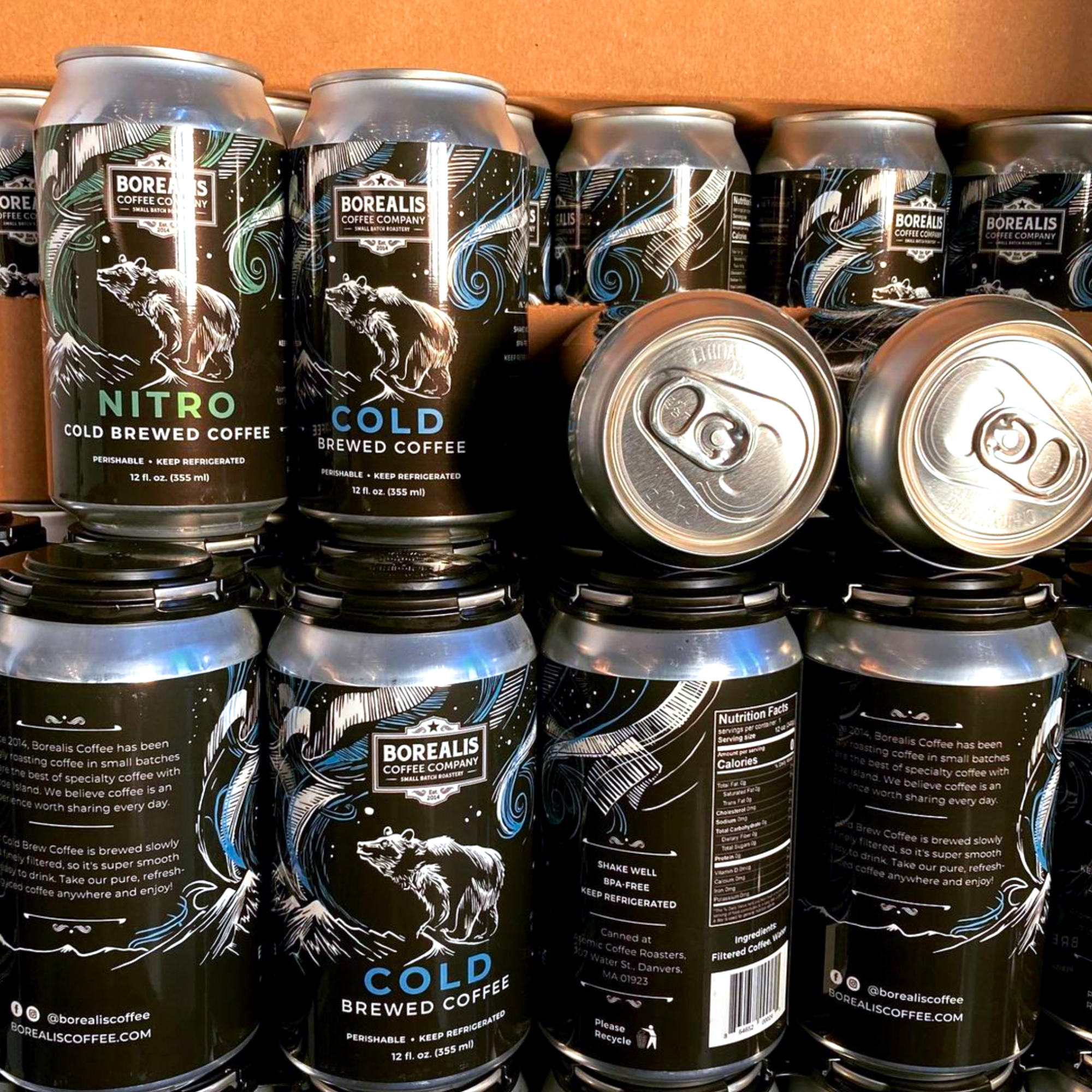
Client Borealis Coffee Company, USA/ Scope: Packaging design, illustration and merchandise.
BOREALIS COFFEE
Client: Borealis Coffee Company, USA
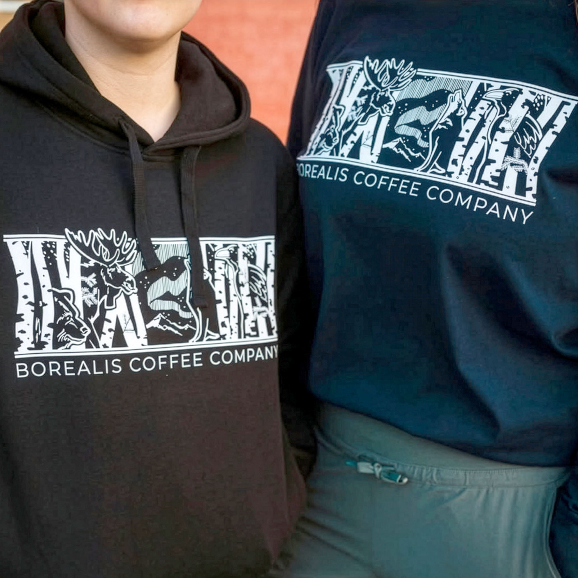
Scope: Packaging design, illustration and merchandise
Context
Borealis didn’t start as a packaging project.
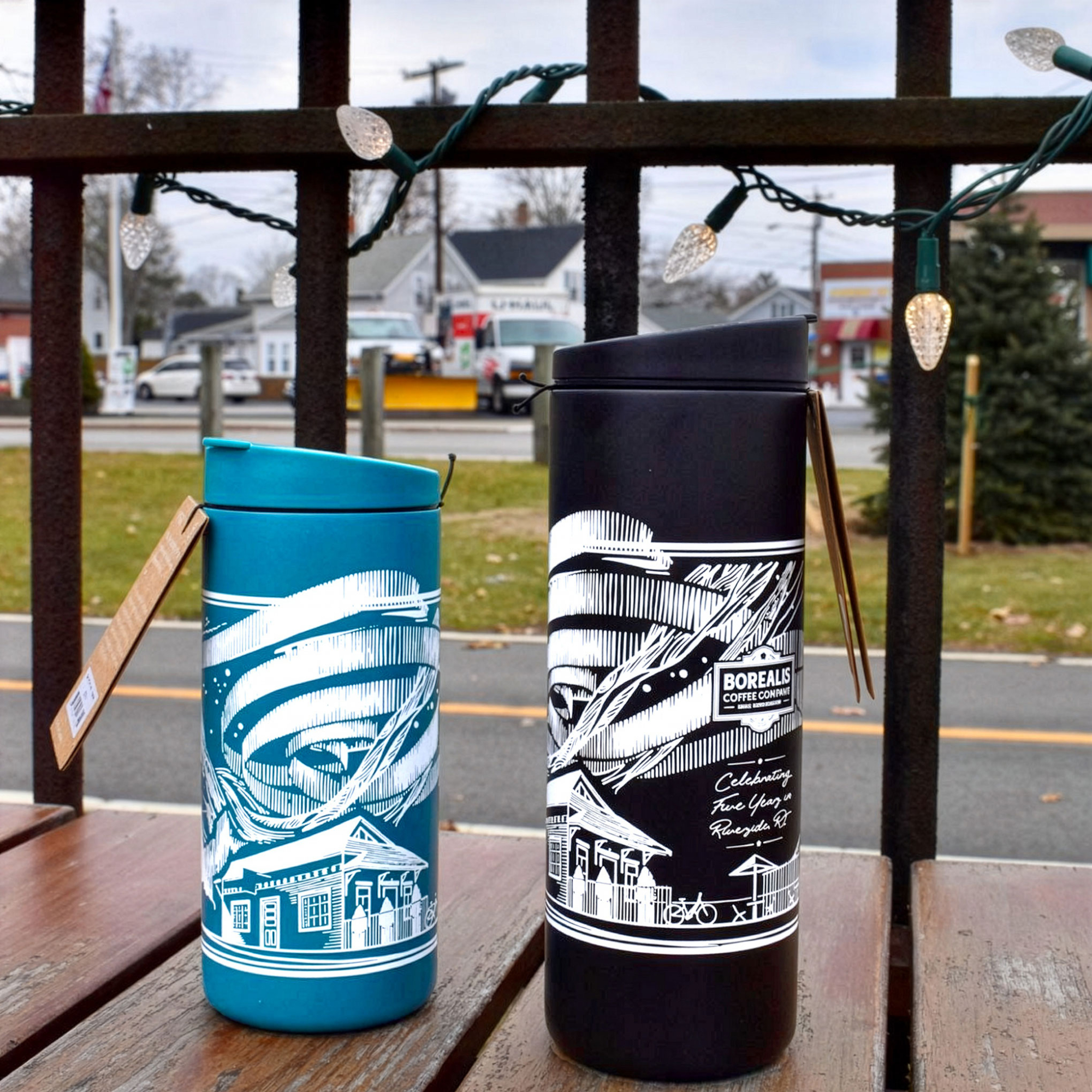
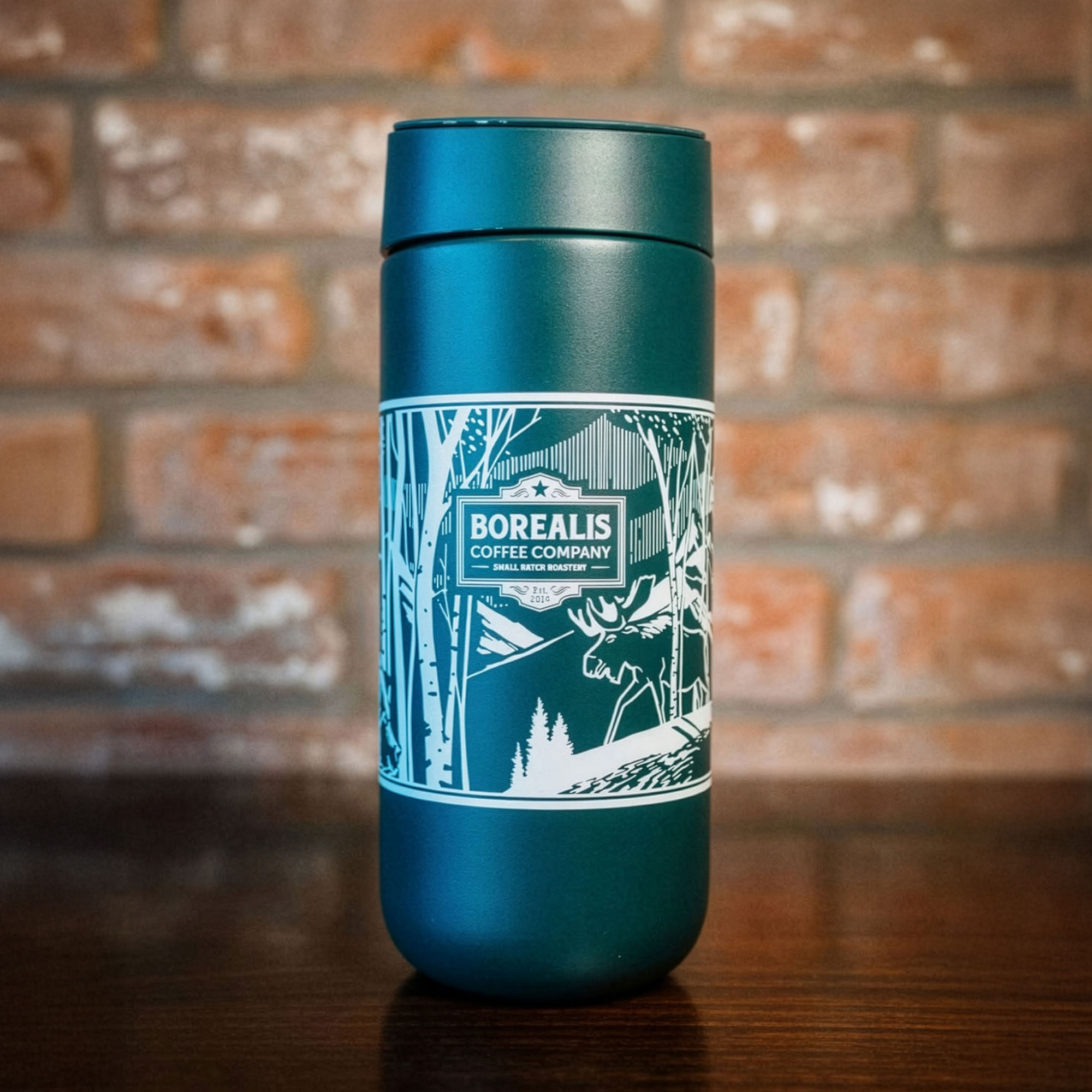
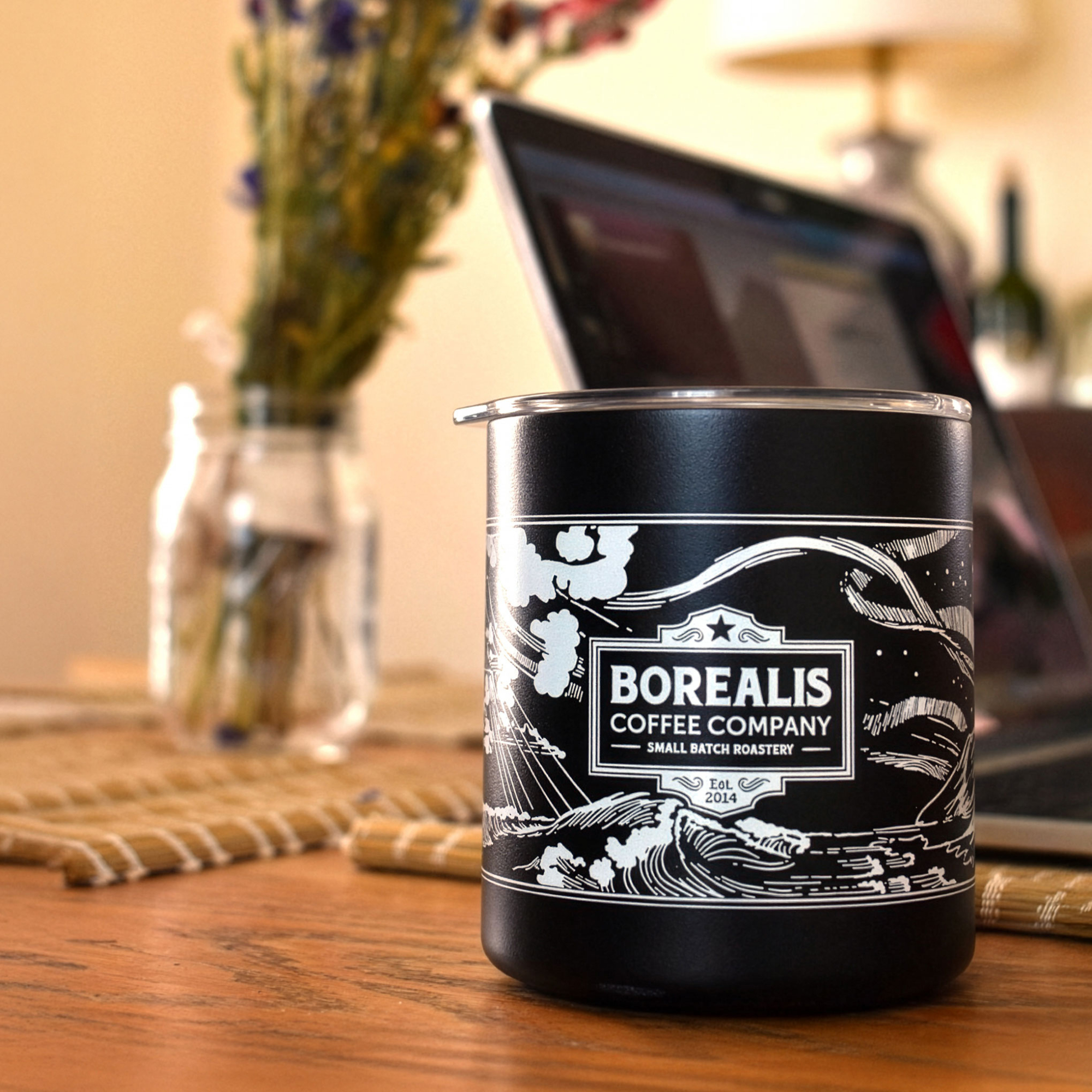
Our collaboration began with a 99designs contest to create an illustration for a coffee mug. After that project, the client invited me to become the company’s ongoing illustrator. Over the following years, the work expanded naturally to coffee packaging, merchandise and later a complete packaging redesign.
Inspired by Alaska’s wildlife and landscapes, the brand already had a strong connection to the North. The challenge was to express that character through a visual language that could remain recognizable across every application.
Approach
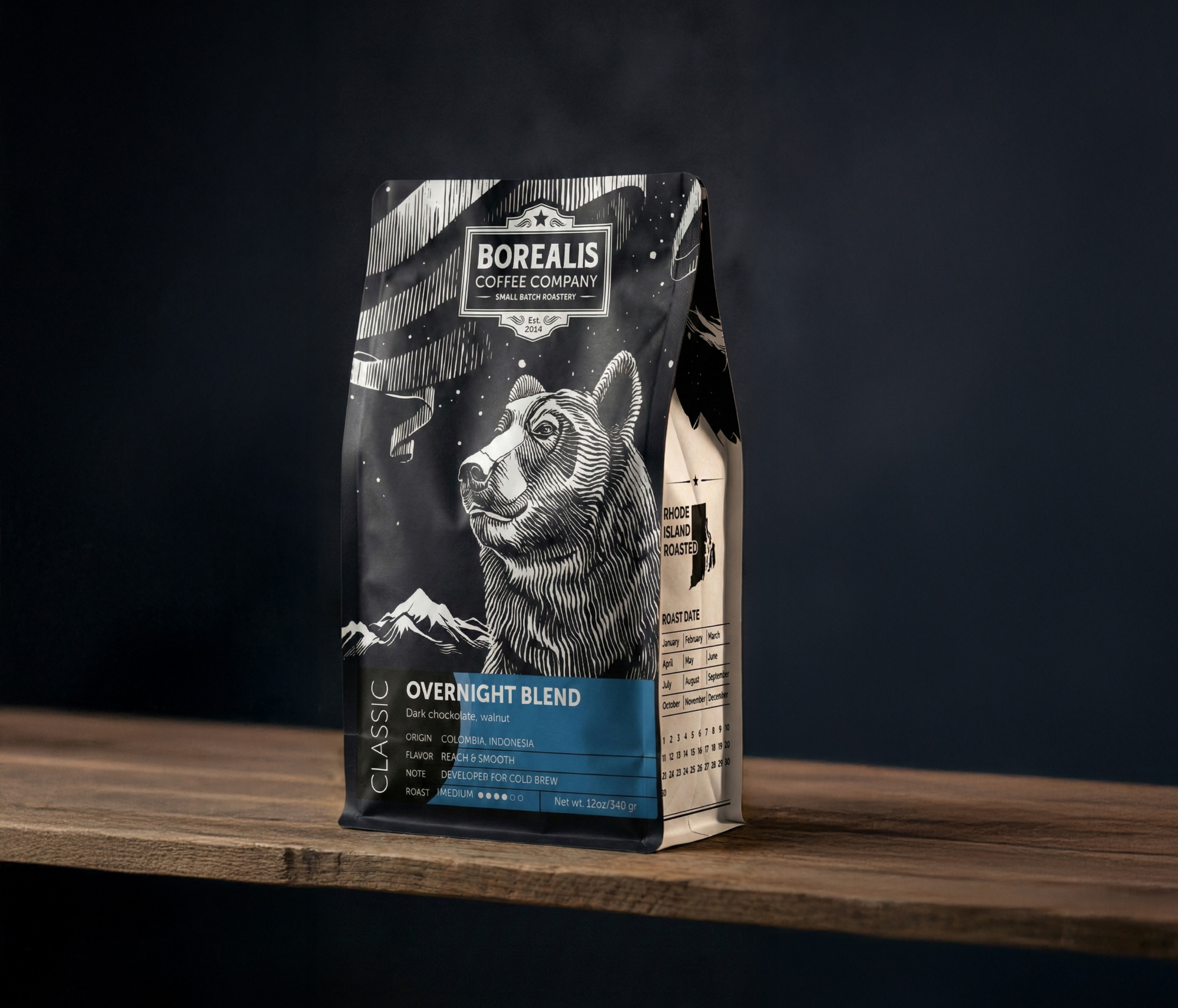
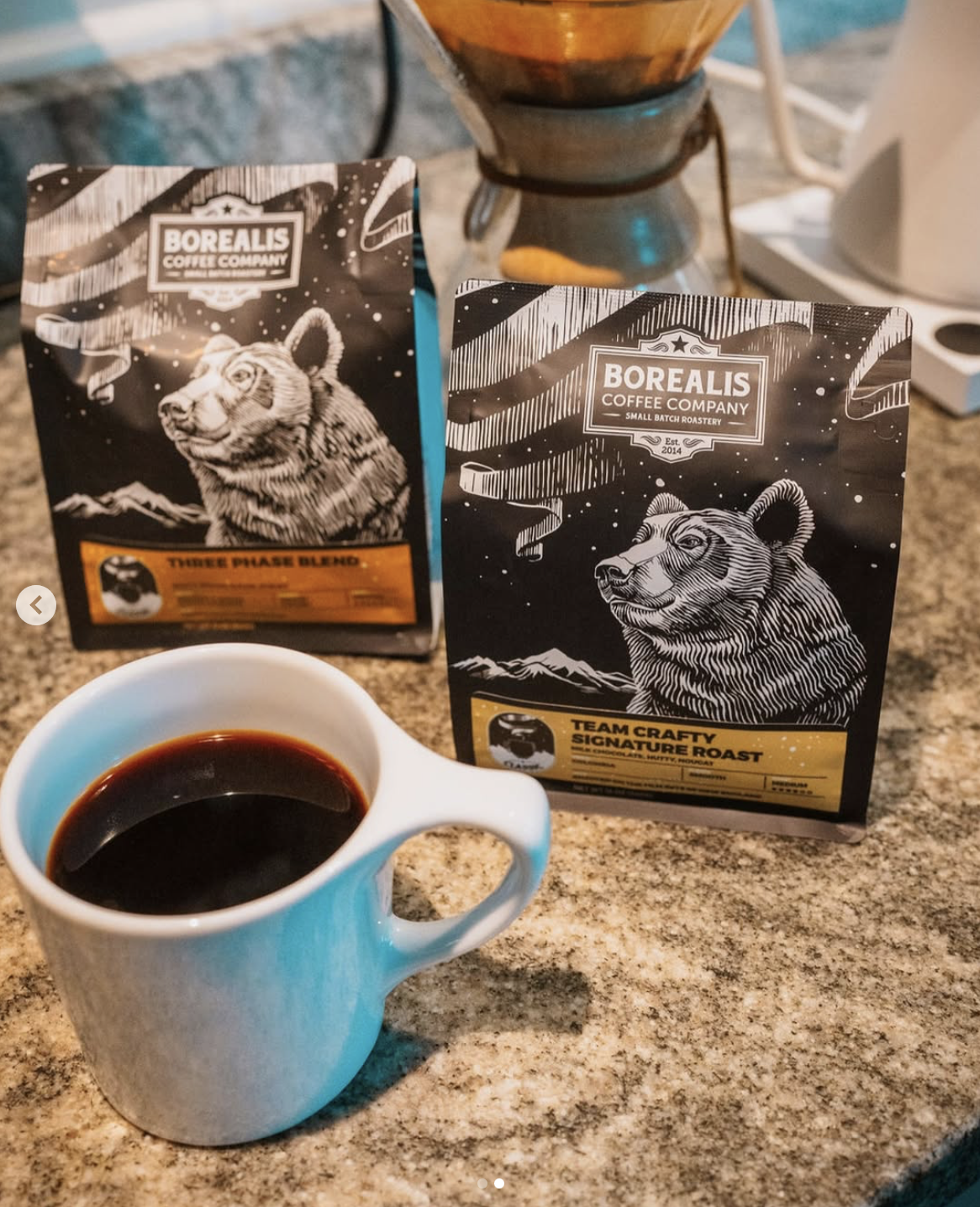
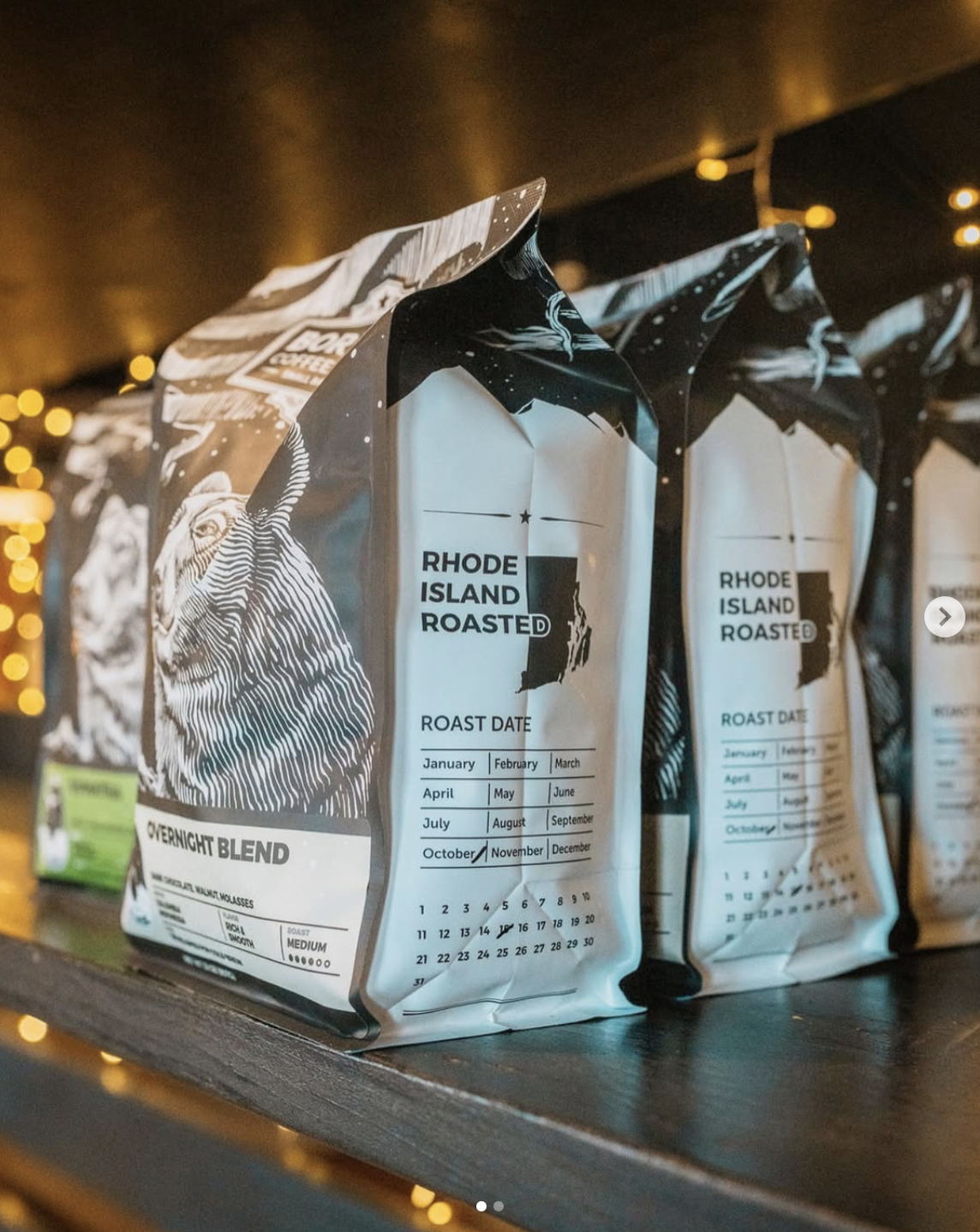
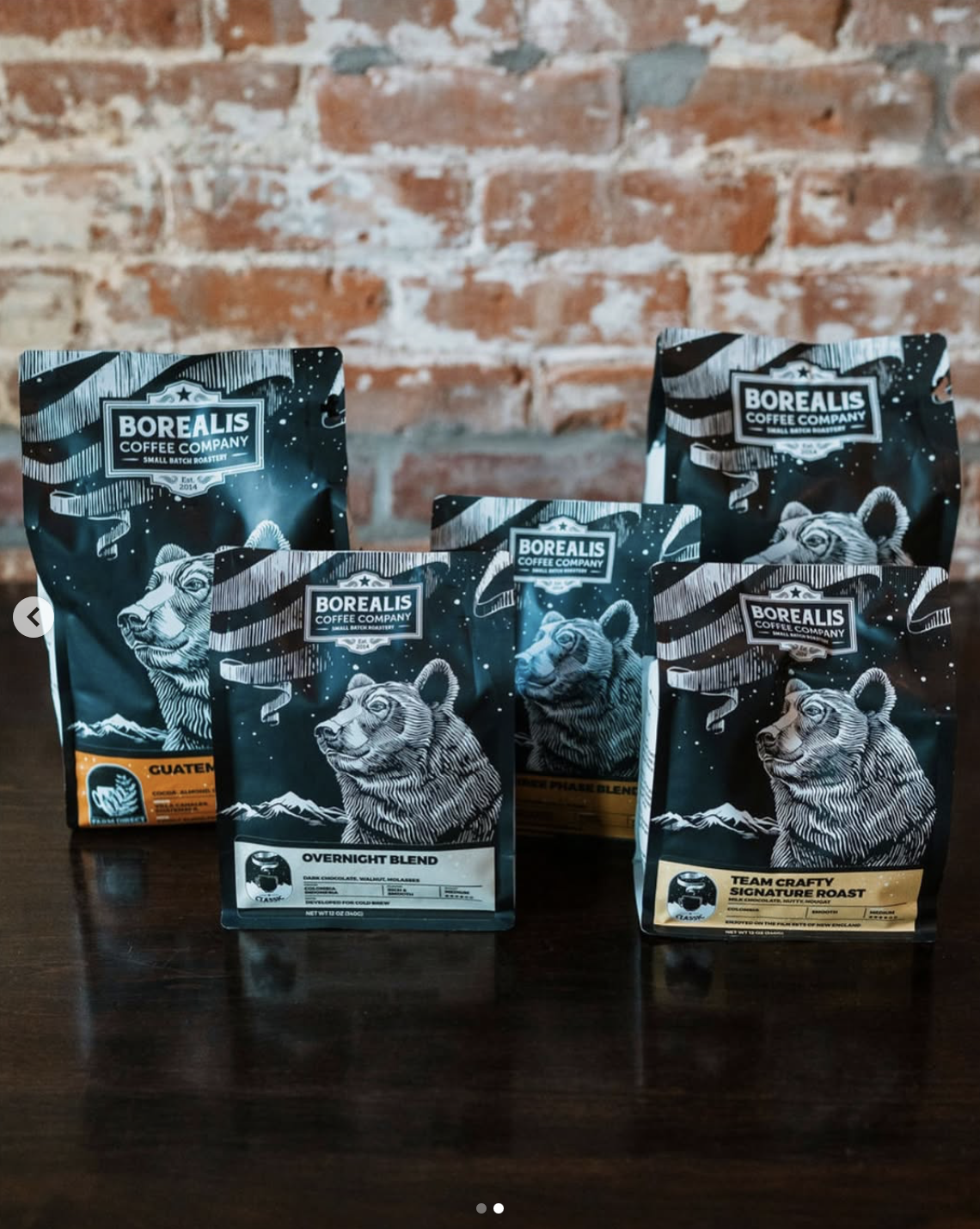
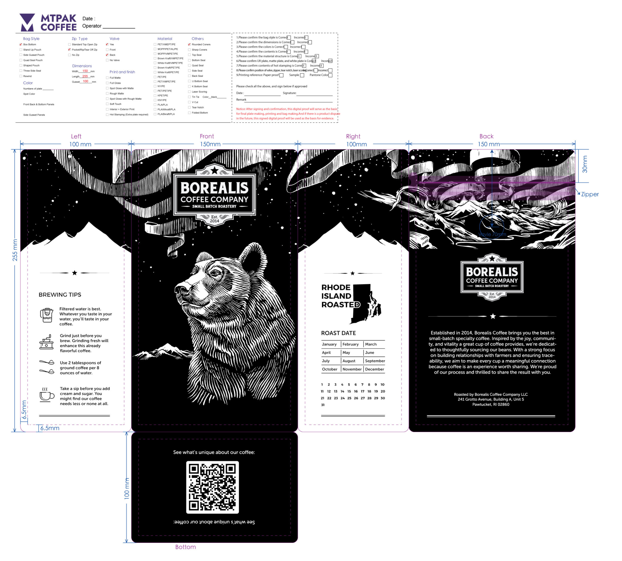
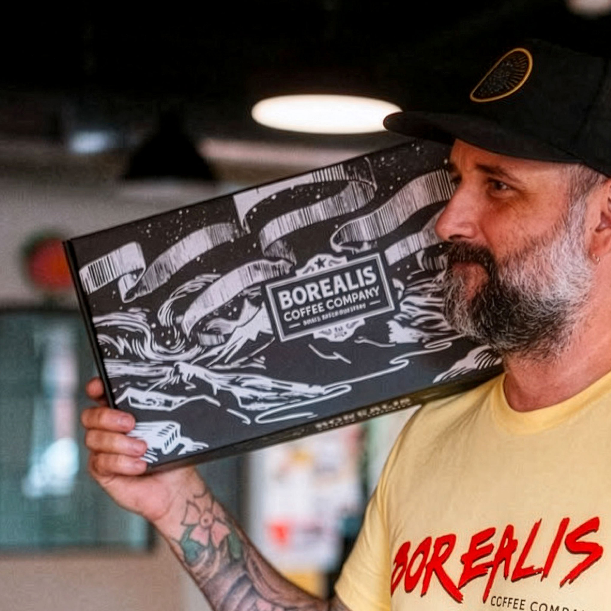
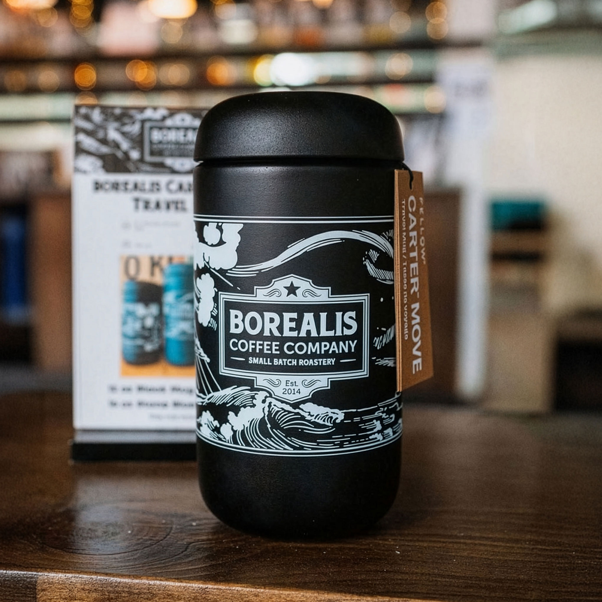
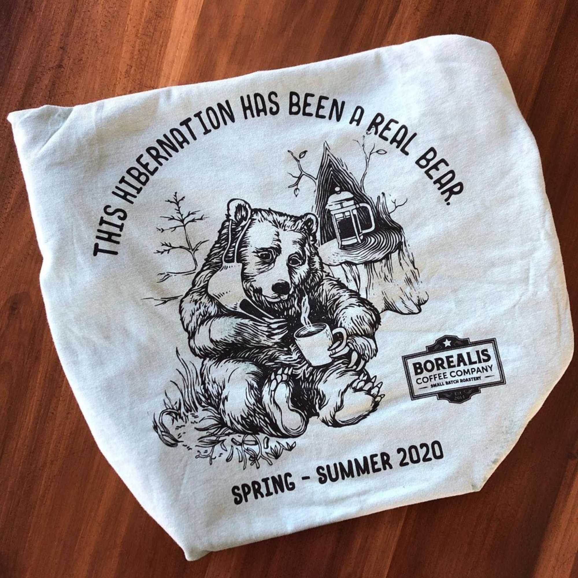
Instead of creating a different style for every project, we developed one consistent graphic language built around black-and-white engraved illustration.
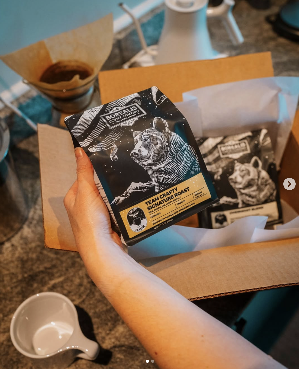
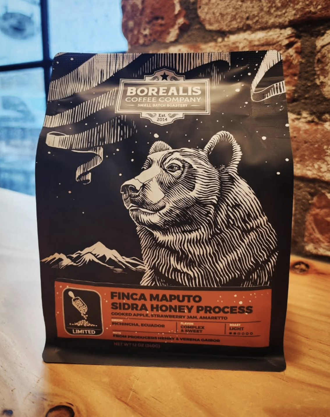
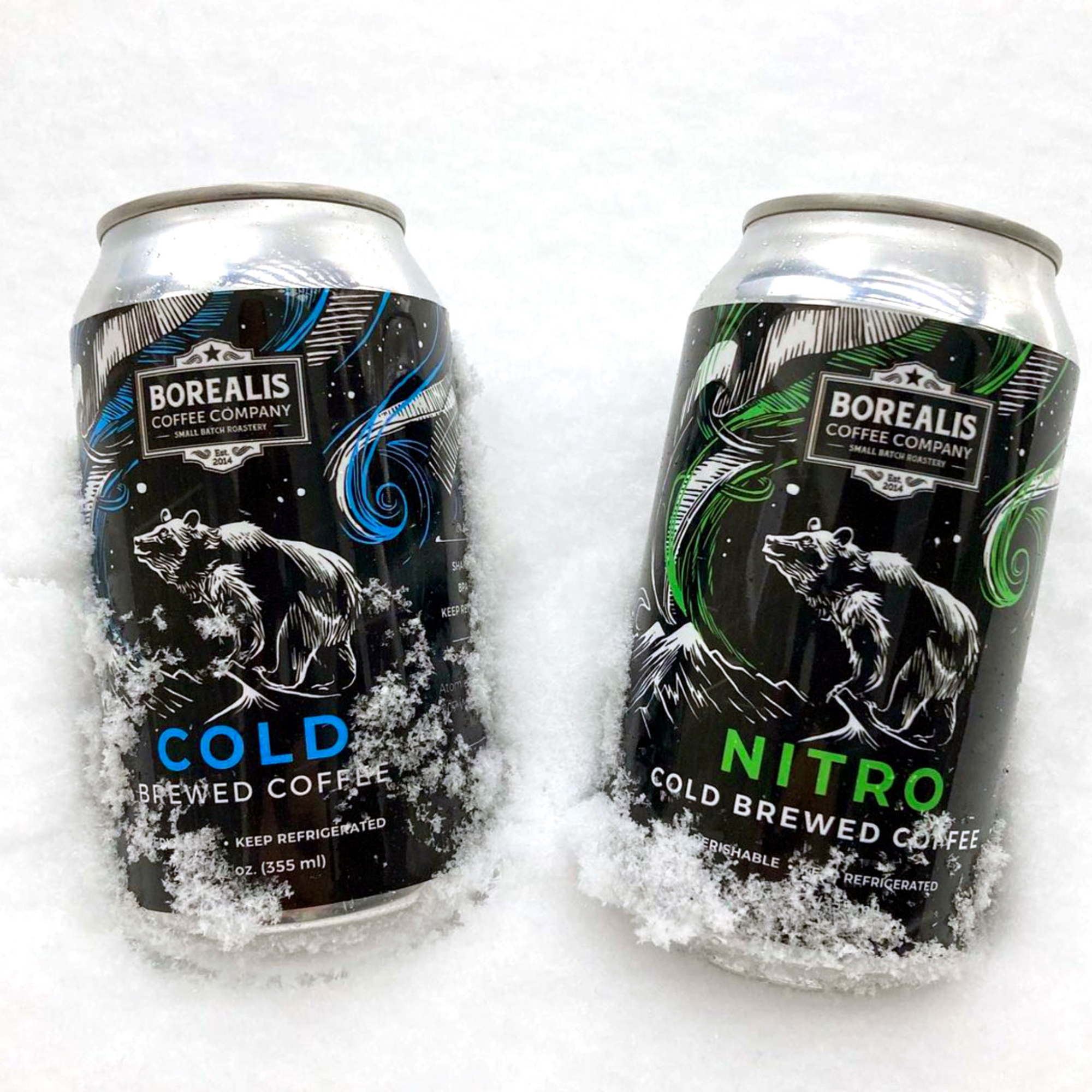
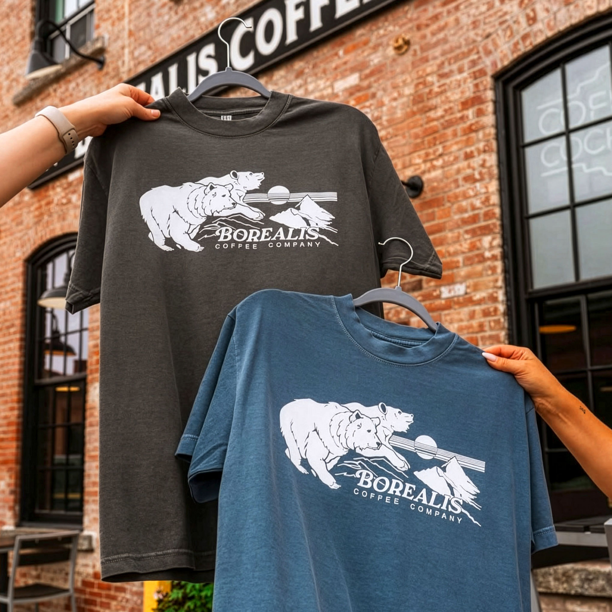
The illustrations rely on confident line work rather than colour, allowing the artwork to remain clear across coffee bags, mugs, apparel and other merchandise. Every new piece became part of the same visual family, while introducing new scenes inspired by northern wildlife and nature.
The result wasn’t a collection of matching designs, but a recognisable artistic voice that stayed consistent over years of collaboration.
Result
Today, Borealis is recognised not by a single illustration, but by a distinctive visual language that appears across packaging, merchandise and brand communication.
The project demonstrates how a consistent artistic style can become part of a brand’s identity. Different products, different illustrations — one unmistakable visual voice.