SAILER — Character-Driven Wine Line
Customer: Sailer vineyards./ Task: Branding & Illustration for Wine Line
Task
SAILER
Client: Sailer Winery, Austria
Scope: Brand identity, packaging design and illustration
Context
Sailer is a small Austrian winery where visitors can taste the wines, meet the people behind them and take a bottle home.
The labels were never meant to compete on crowded supermarket shelves. Their purpose was different: to make the wines feel personal, welcoming and memorable for people visiting the winery itself.
The winery already had names and personalities for each wine. My task was to turn them into a coherent visual identity.
Approach
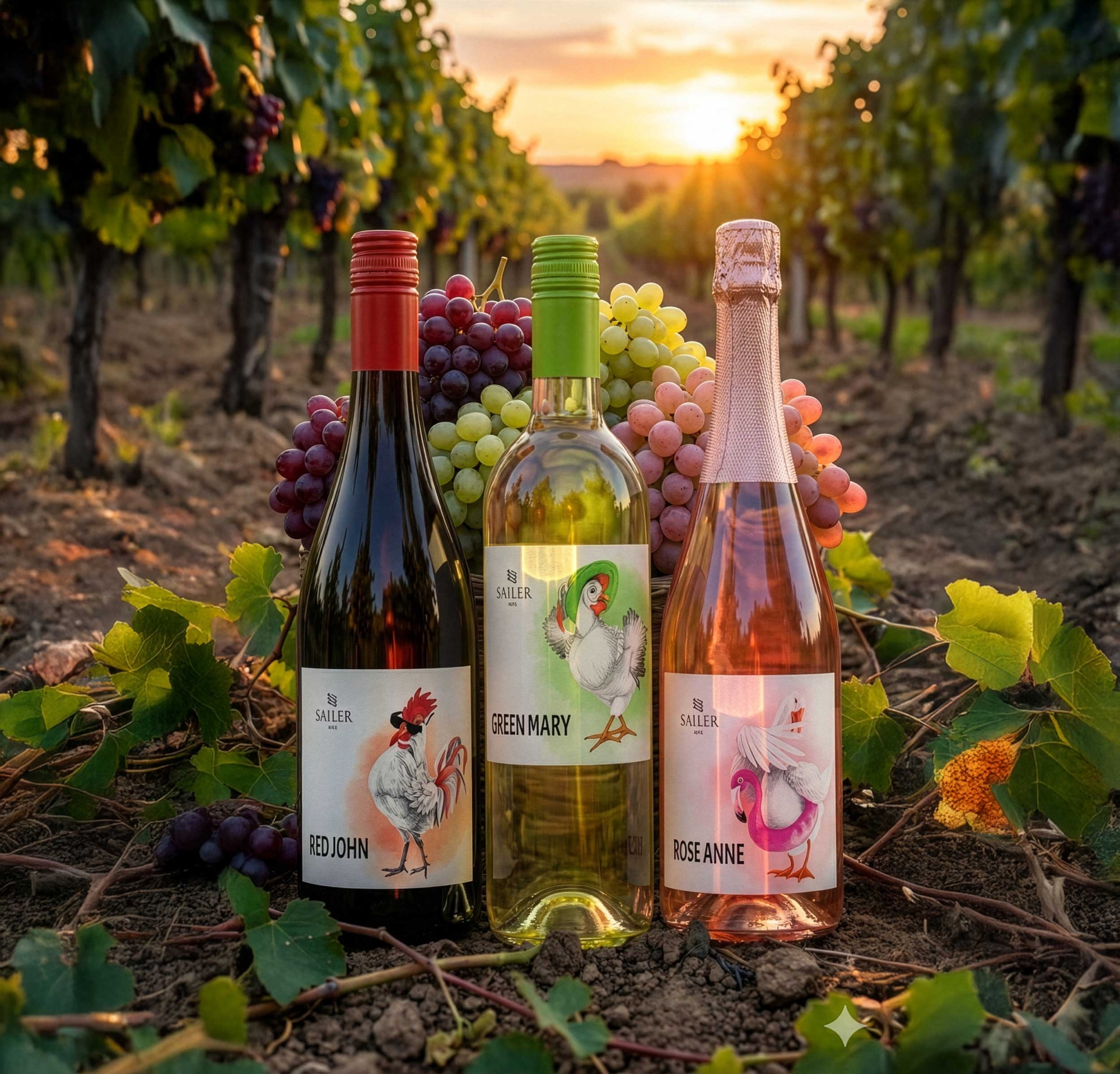
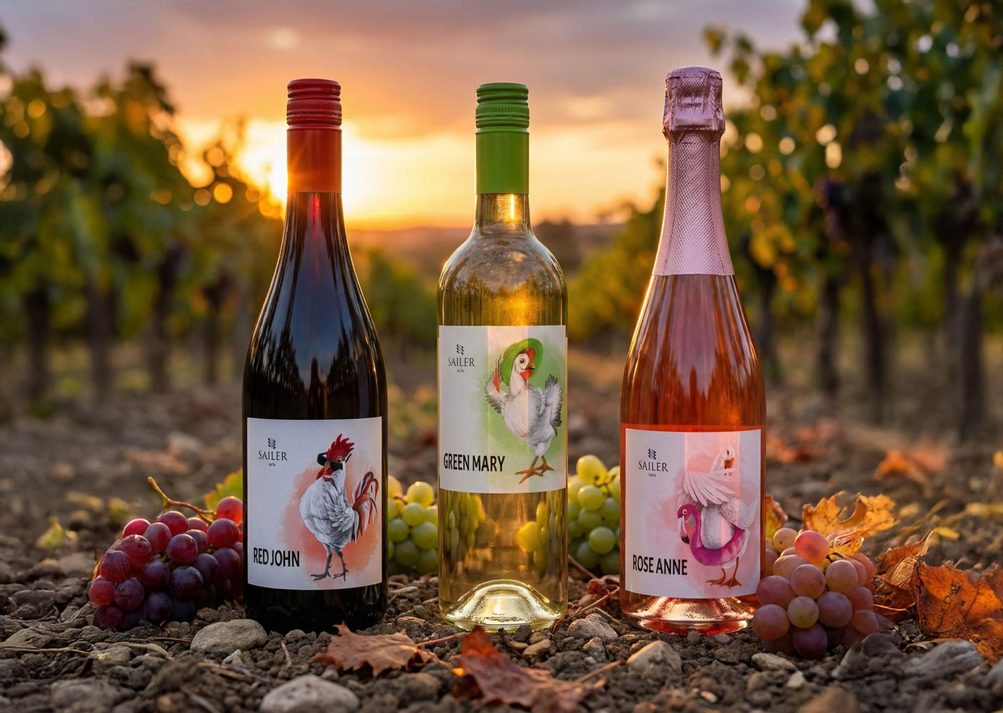
Instead of illustrating the wines, I illustrated the personalities behind them.
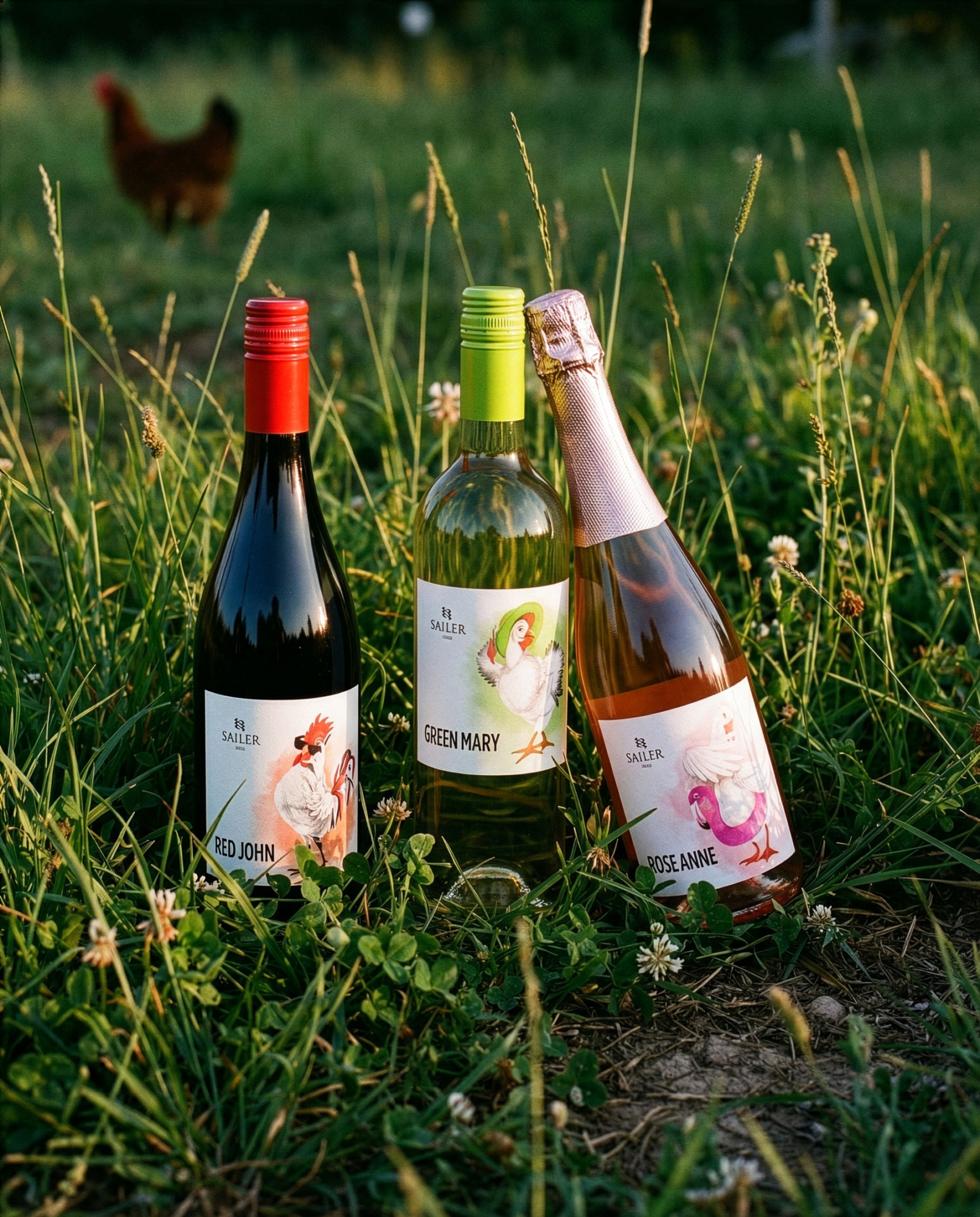
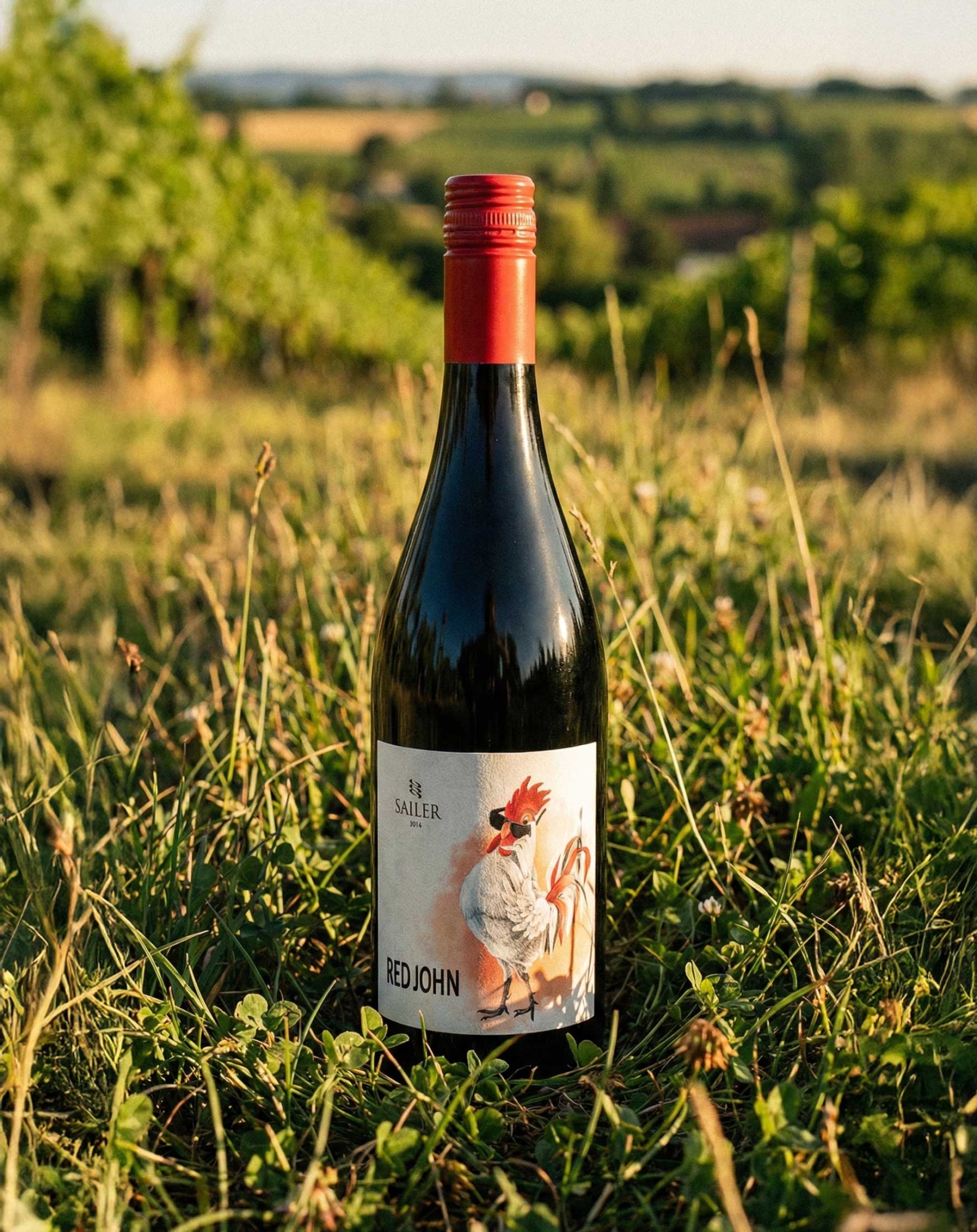
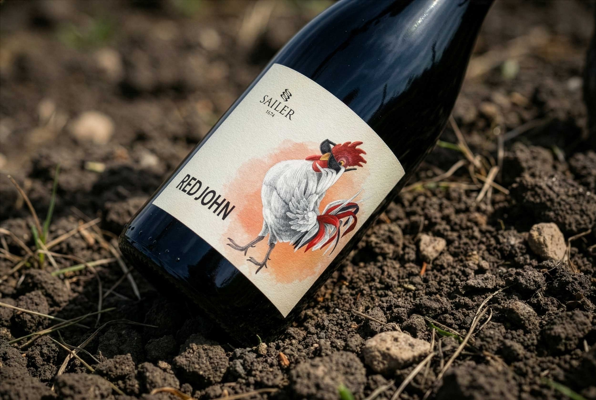
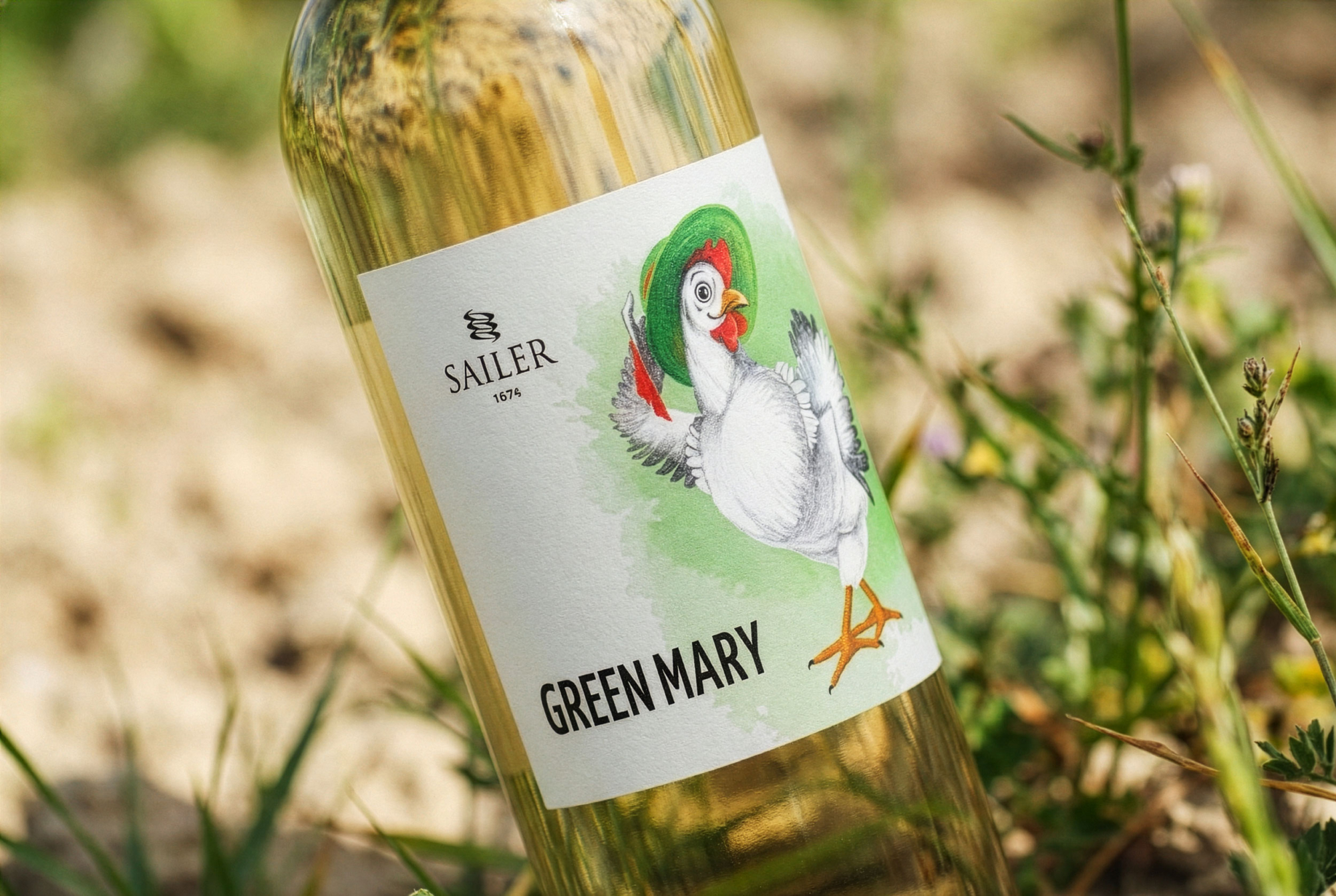
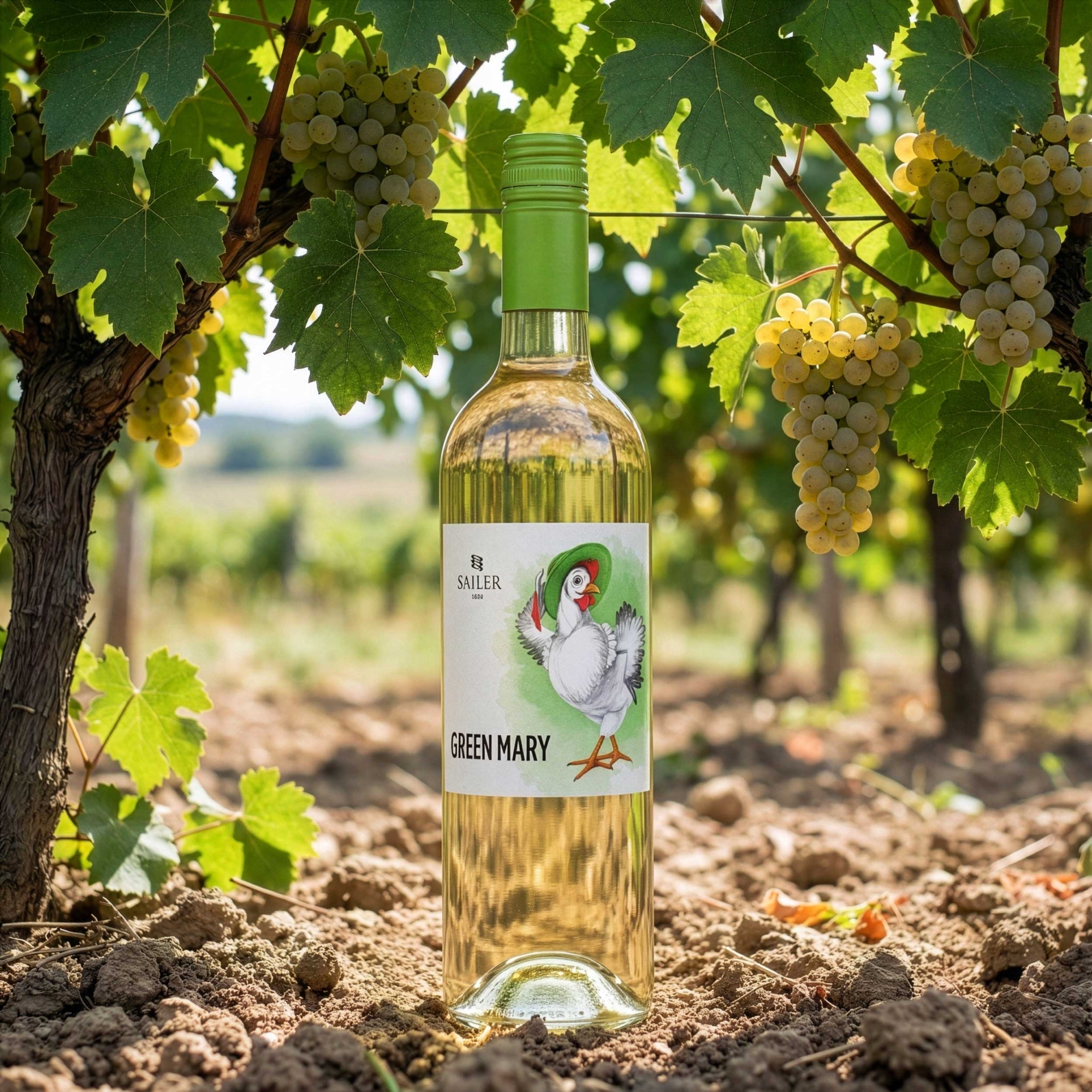
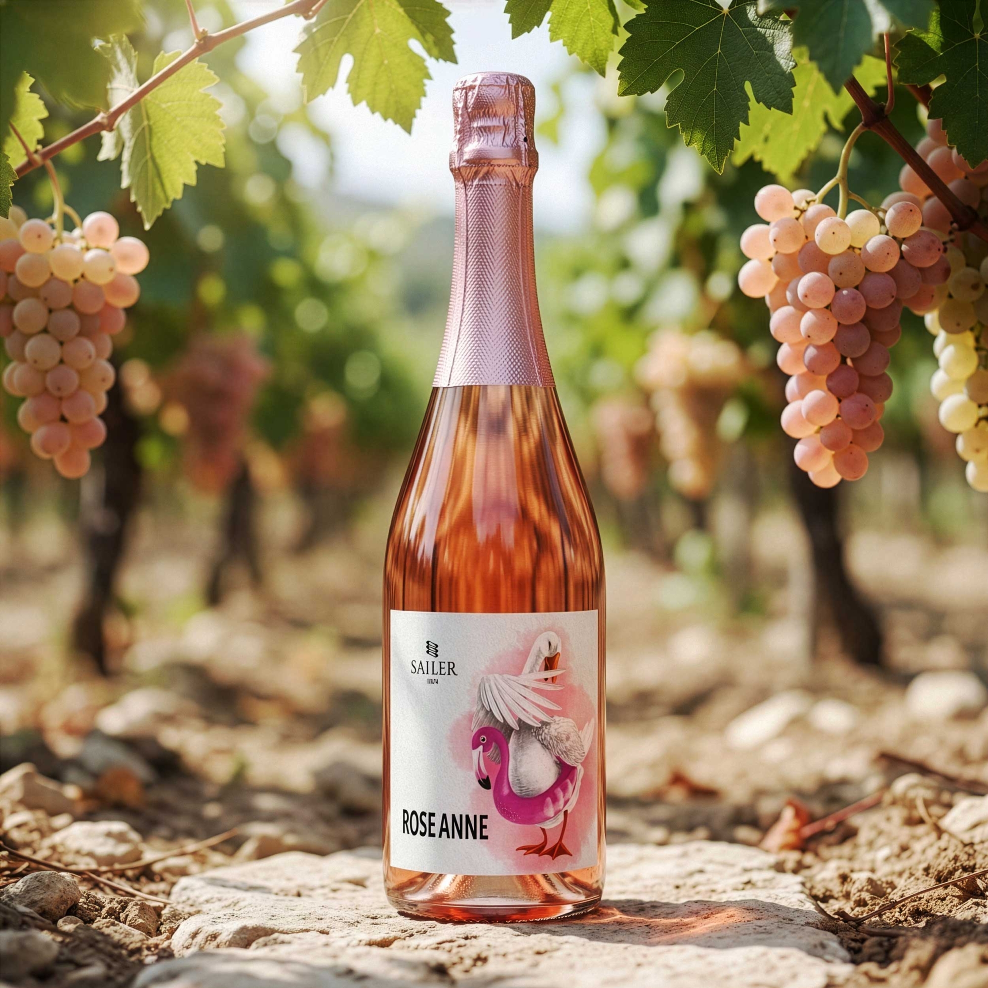
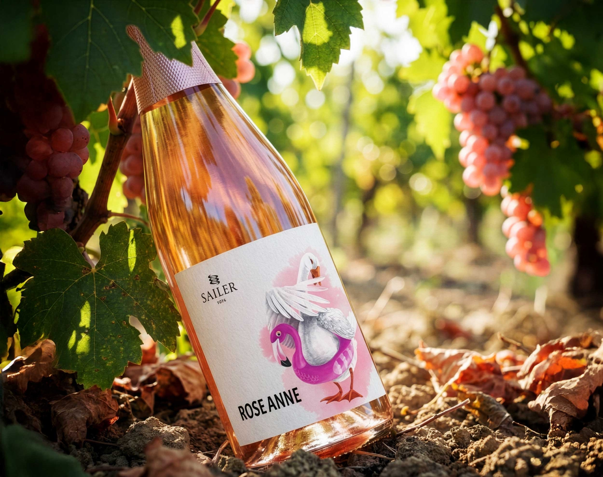
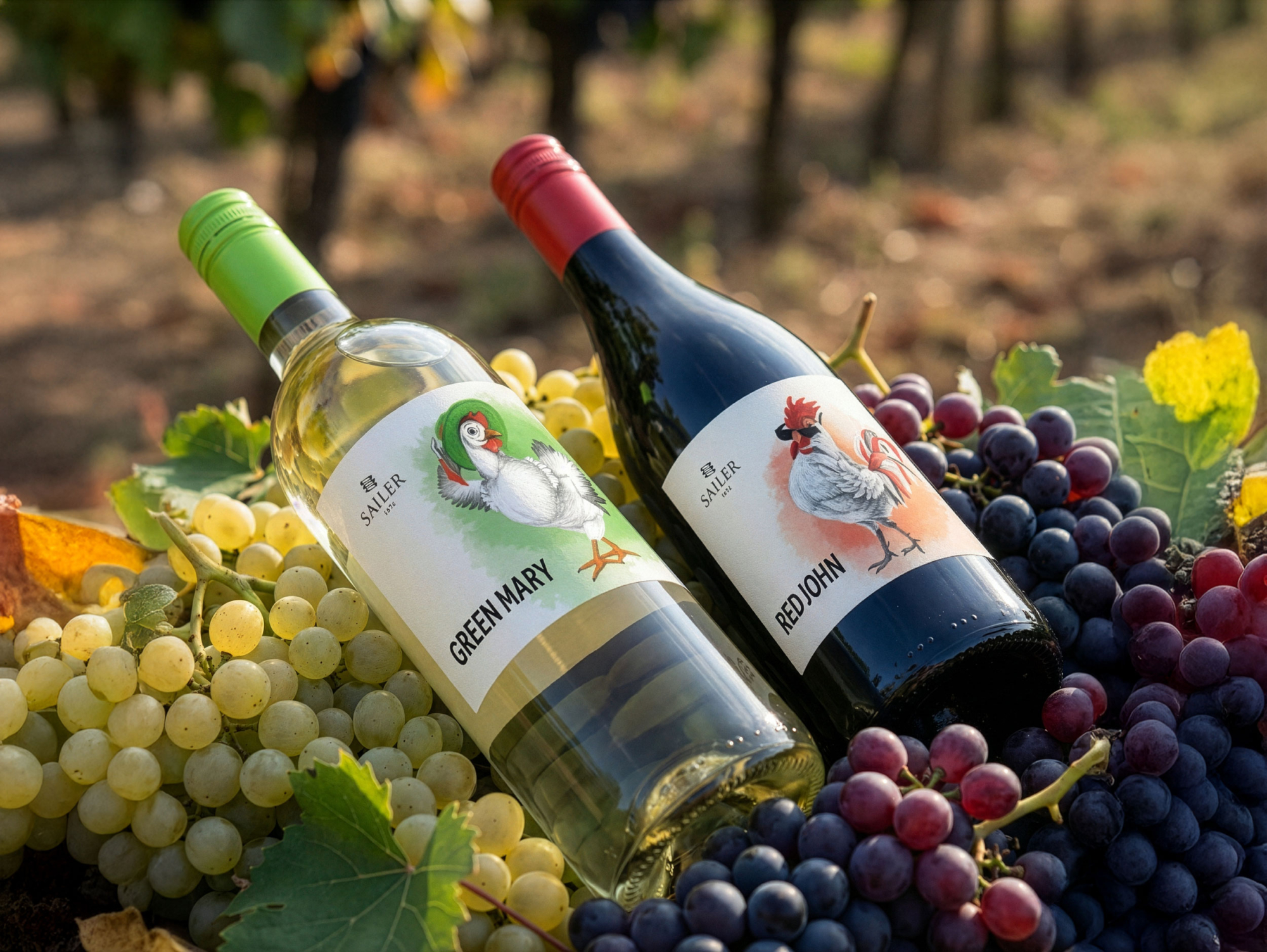
A confident rooster became Red John. Green Mary was imagined as a playful, self-aware hen. Rose Anne became a goose dreaming of being a flamingo, complete with a pink flamingo swim ring that quietly reveals her character.
The labels remain intentionally restrained. Clean typography, generous white space and simple compositions allow each illustration to become the focus, giving every bottle its own identity while keeping the collection visually connected.
Result
The wines became easy to remember not by grape variety, but by character.
Visitors don’t choose between three similar labels. They meet three different personalities, each bringing its own mood while belonging to the same family. The result is a wine collection that feels approachable, distinctive and perfectly suited to the atmosphere of a small family winery