Offshore Gin Label
Customer: Offshore Gin/ Task: Gin label design and illustration
Description
Offshore Gin
Independent Packaging Exploration
Scope: Label Design · Illustration · Packaging Materials
Context
Offshore Gin is an independent packaging exploration inspired by the idea of something valuable kept outside the ordinary.
Rather than building the identity around nautical clichés, the concept focuses on hidden value — a bottle that feels stored, protected, and quietly discovered.
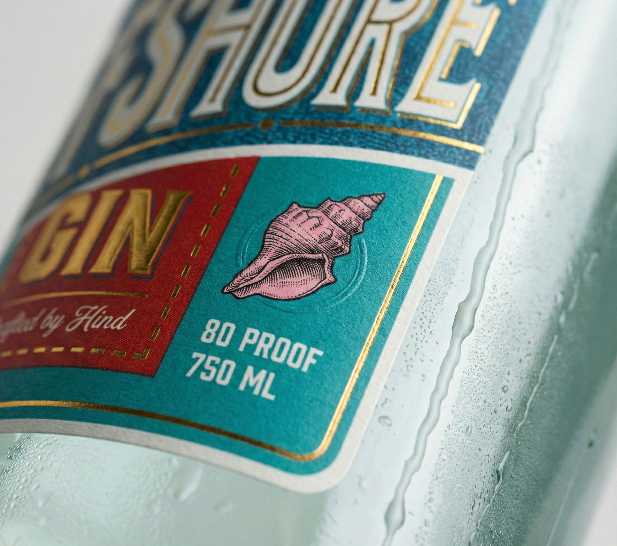
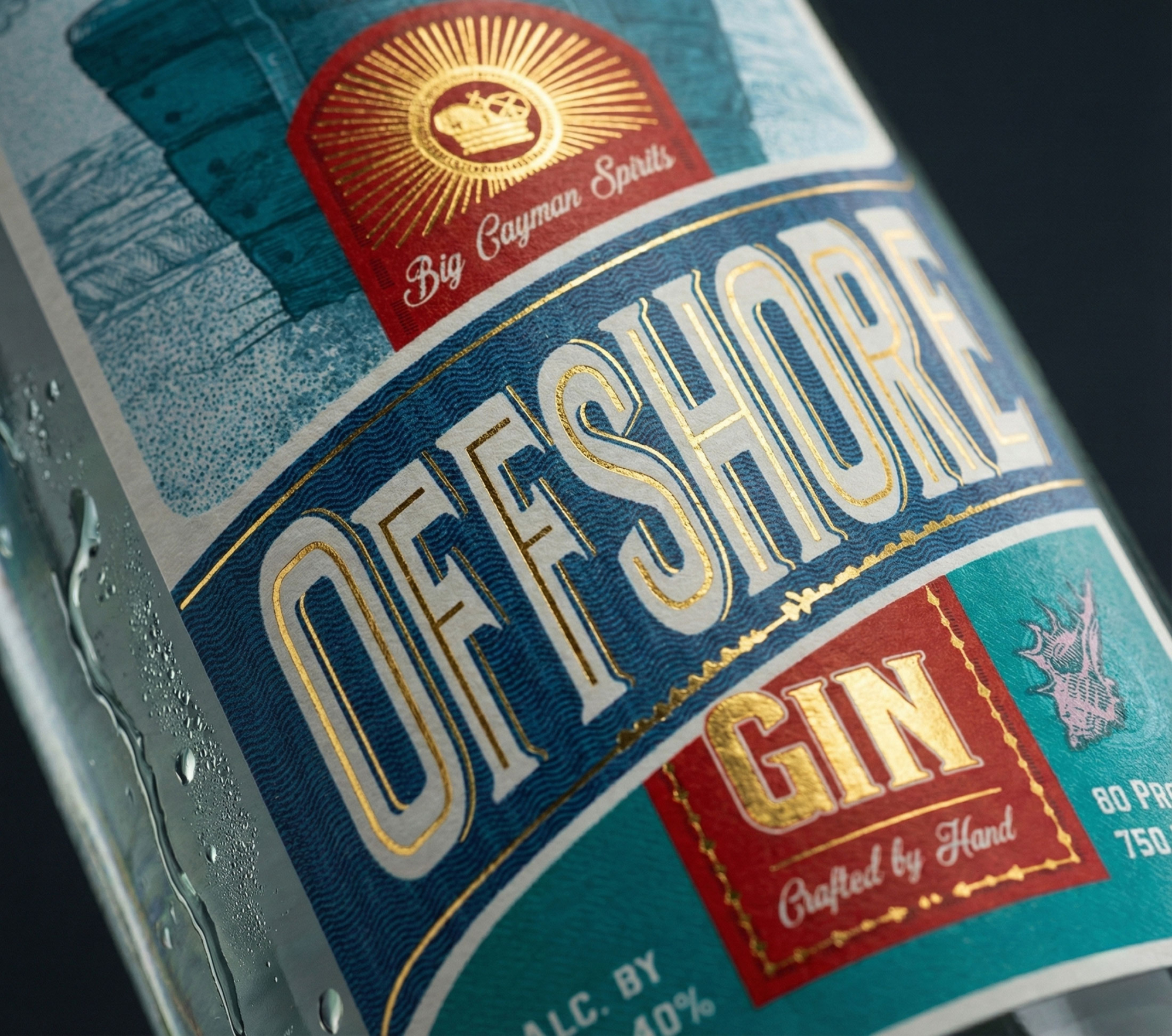
The project also explores how material choices can create a premium perception through paper, foil, texture, and restrained colour rather than visual excess.
Approach
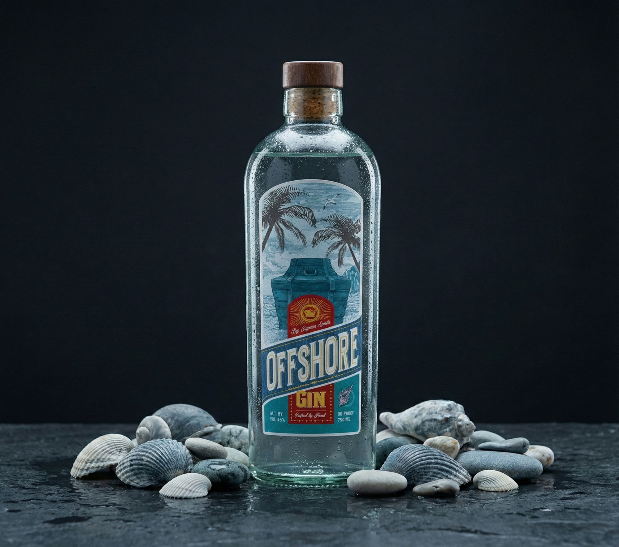
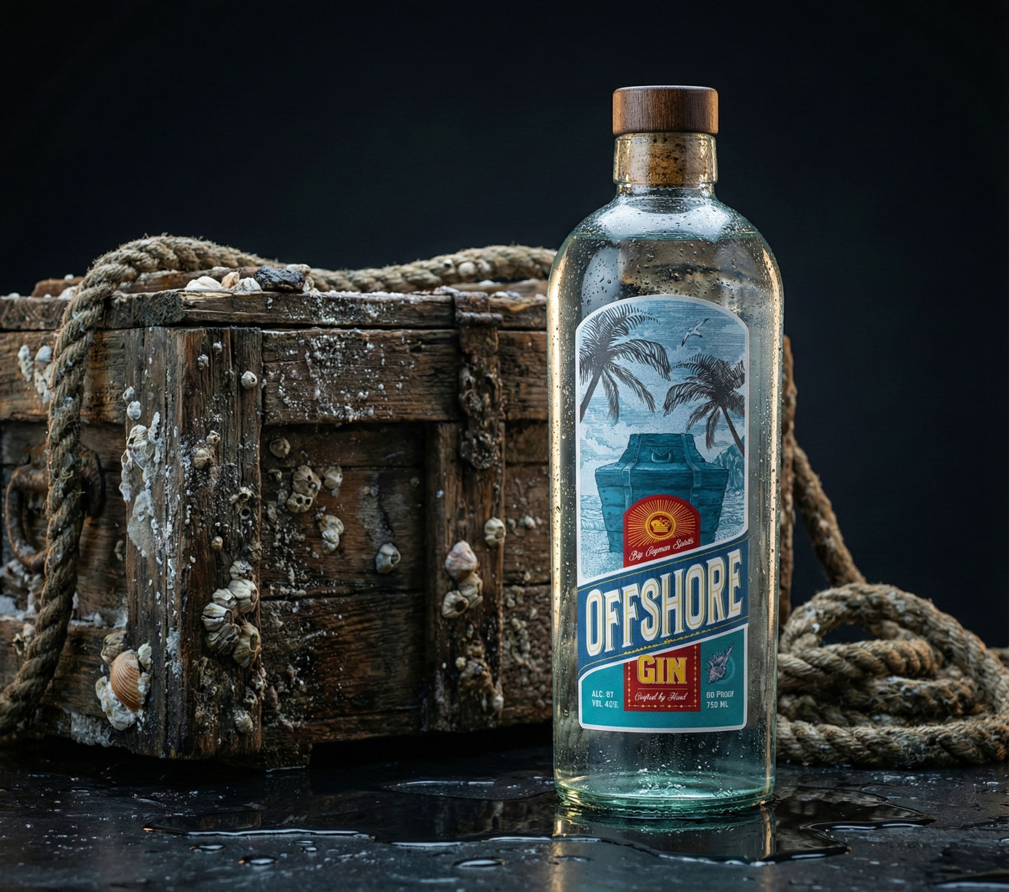
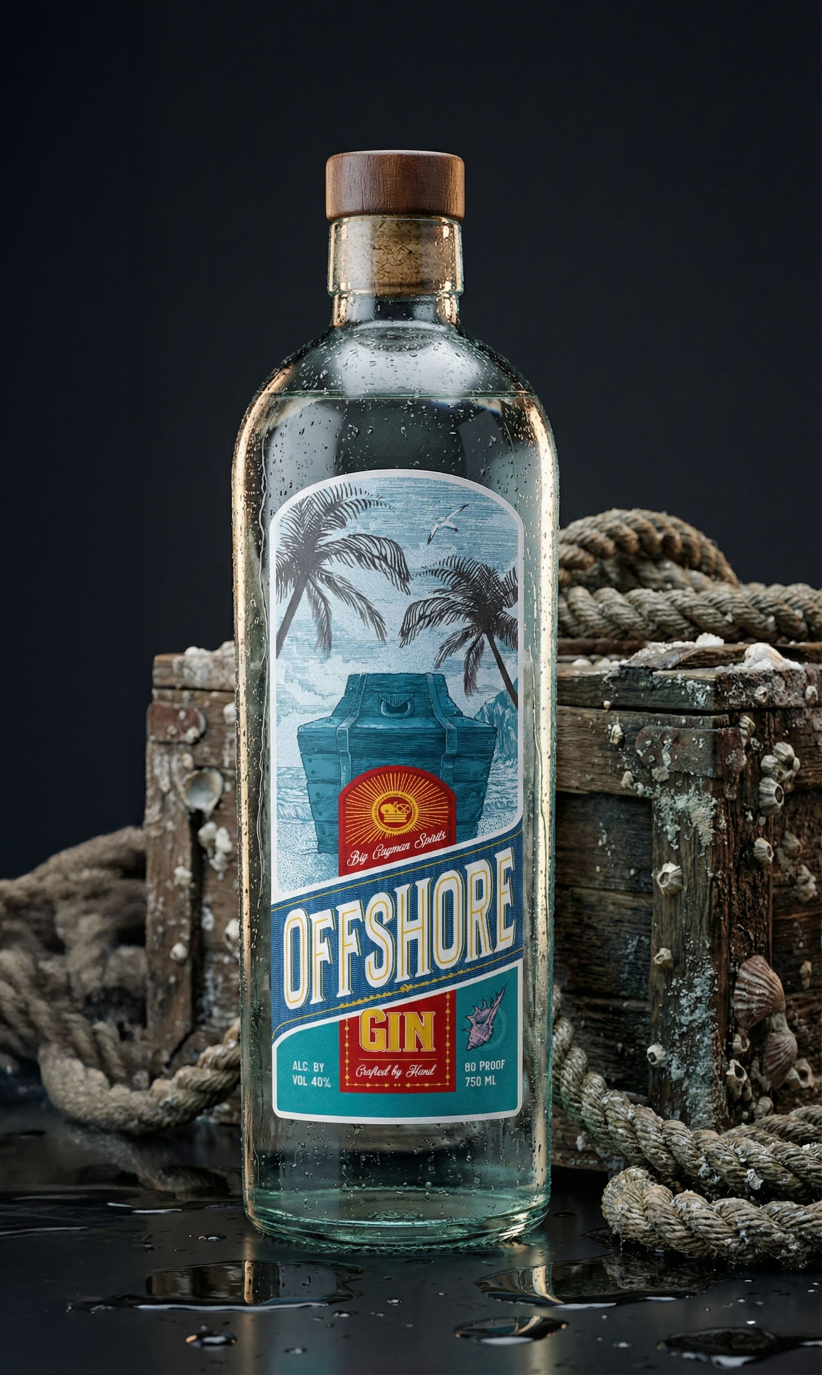
The label is built around a simple central metaphor: a treasure chest.
Instead of acting as decoration, it represents the bottle itself — something worth keeping rather than displaying.
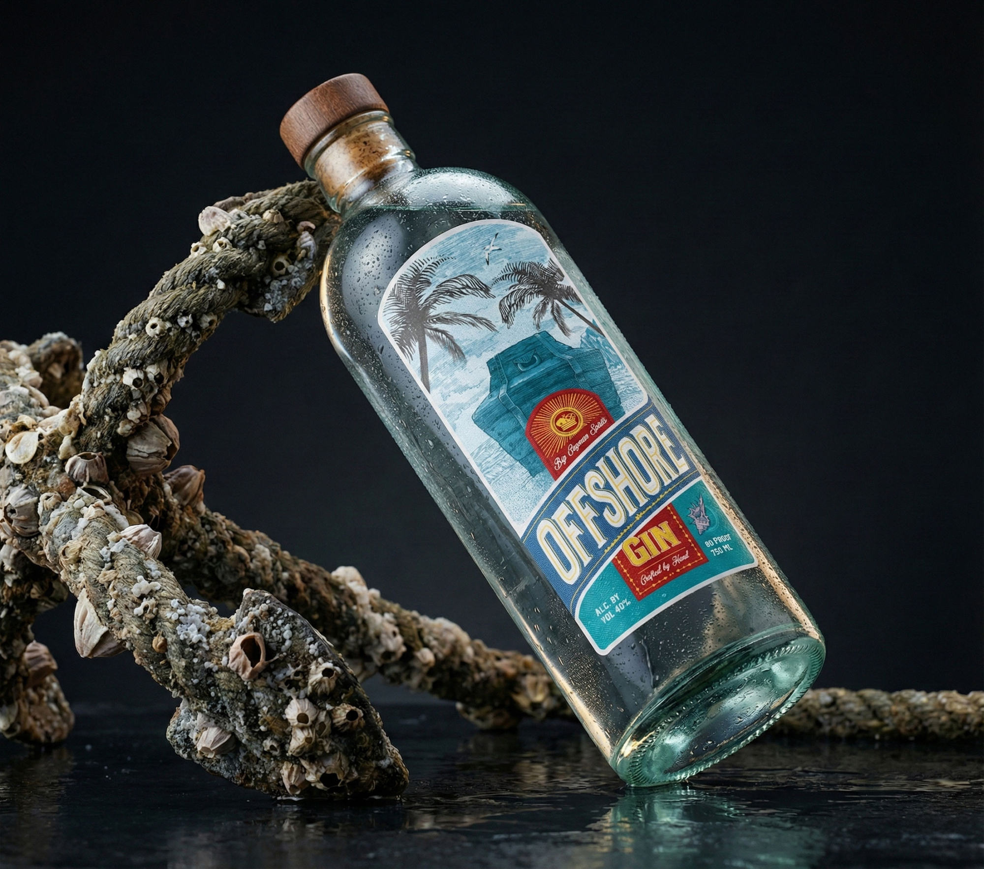
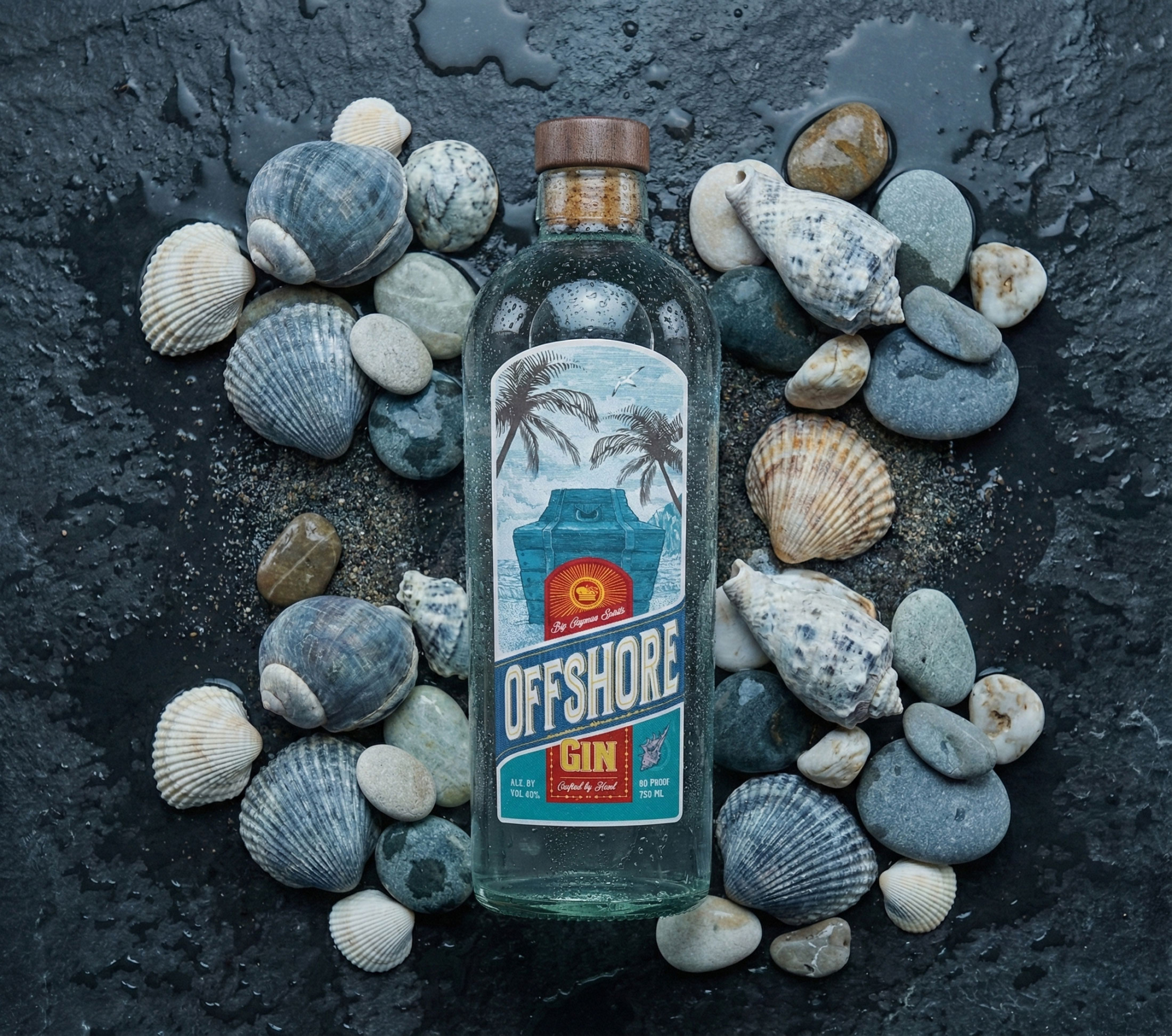
The visual language combines engraved-style illustration, classic typography, and a restrained colour palette inspired by the sea.
Particular attention was given to production details, including textured paper and selective gold foil, allowing the materials to become part of the design rather than an afterthought.
Result
The result is a packaging concept that relies on atmosphere instead of spectacle.
Its premium feel comes from proportion, typography, texture, and finishing rather than complexity.
The project explores how a bottle can communicate rarity and value through quiet visual cues, creating an object that invites a closer look rather than demanding attention.