Wine · Redesign · One label since 2018
Sailor Winery
— the same anchor, redrawn
The challenge
Sailor Winery is a small family estate in Mill Creek Valley, above The Dalles. Dry-farmed vines on a steep, hot, windy hillside — a slope with more in common with Tuscany than with the rest of Oregon. That is why the grape here is Sangiovese.
They already had a label, and the right idea was already on it. The owner's anchor — a real one, which reached me as an engineering drawing: dimensioned in millimetres, with a second sheet detailing the eye bolt shank, the pin, the nut, the plug weld, the swivel.
On the bottle, that drawing had been traced. A thin outline with no weight in it, a chain arched over the top like the handle of a basket, script lettering that could have sold anything, and a black box around the whole thing.
Nothing needed inventing. The anchor needed drawing.
The face
An engineering drawing is flat on purpose. Front elevation, side elevation, an angle of swing. It gives you every measurement and tells you nothing about how the object stands in a room.
So the work happened before the drawing did: reading the projections, building the anchor in three dimensions in my head, turning it until it sat at an angle worth engraving. Then hatching it back down to line — flukes, crown, shank, the shackle at the top.
The two marks on the flukes came across untouched: a square on one, a circle on the other. Nobody will notice them. They are the reason it reads as this anchor and not as the idea of an anchor.
The chain got the other correction. It now hangs from the shackle in a loose S — the way chain hangs when something heavy is on the end of it.
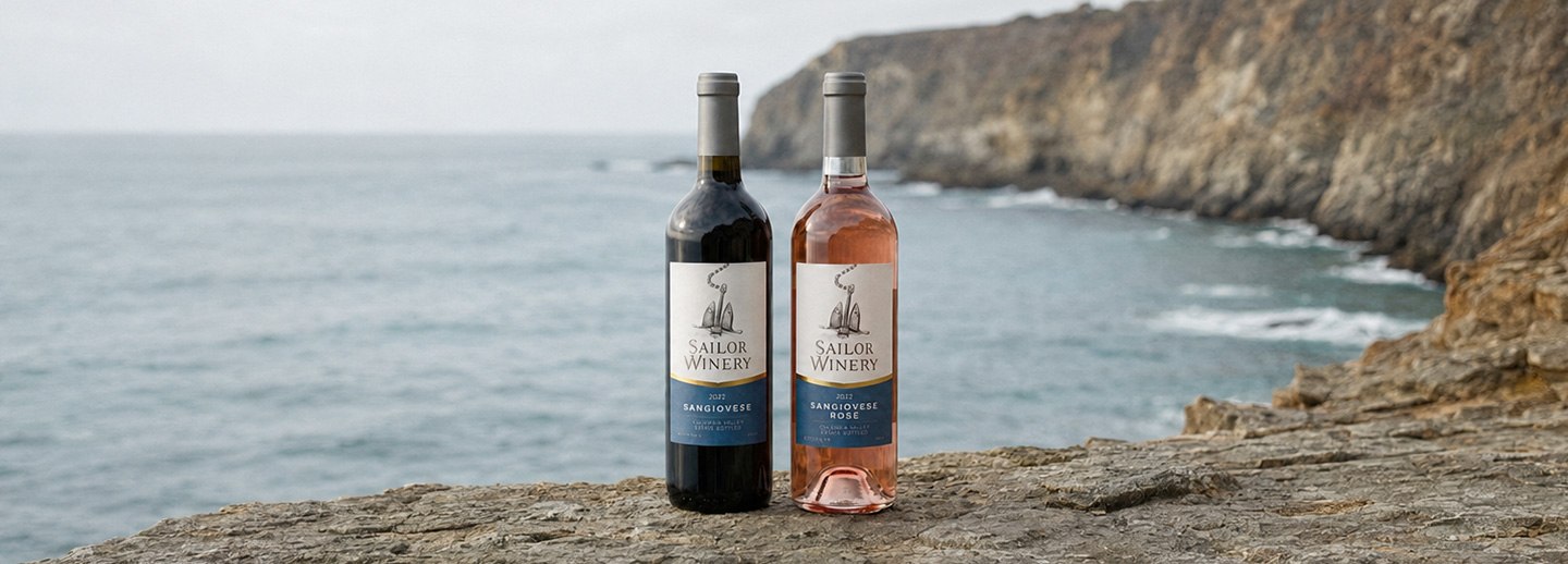
Around it, everything steps back. Hand-drawn lettering in place of the script. Uncoated cream stock. A gold wave cutting across to a deep blue panel, replacing the black box: the wave puts water in the layout without anyone drawing any.
What stayed,
what changed
Stayed — from the old label
The anchor. The vertical order: mark on top, wine below. Columbia Valley, estate bottled.
Changed — how it is made
Outline into engraving. Script into drawn lettering. A black frame into a gold wave. A chain that rested into a chain that hangs.
Stayed — across the range
The mark, the lettering, the wave, the blue panel and the order inside it.
Changed — bottle to bottle
One line of type. And the colour of the wine behind the glass.
The Sangiovese and the Sangiovese Rosé carry the same label — not a variant of it, the same one, with the varietal line swapped. The wine supplies the difference. The label supplies the brand.
The result
Drawn in 2018, on the shelf from the 2019 vintage. Since then the winery has come back every year — never for a new label, always to change the vintage on the front and the data on the back.
Eight years, one drawing, two wines, and no redesign in any of them.

Want one of these
for your own range?
Tell me what you're making and what comes after it. I'll tell you which chapter it is — and if it isn't a fit, I'll say so.