Wine label design.
Wine and spirits, and the character on the front.
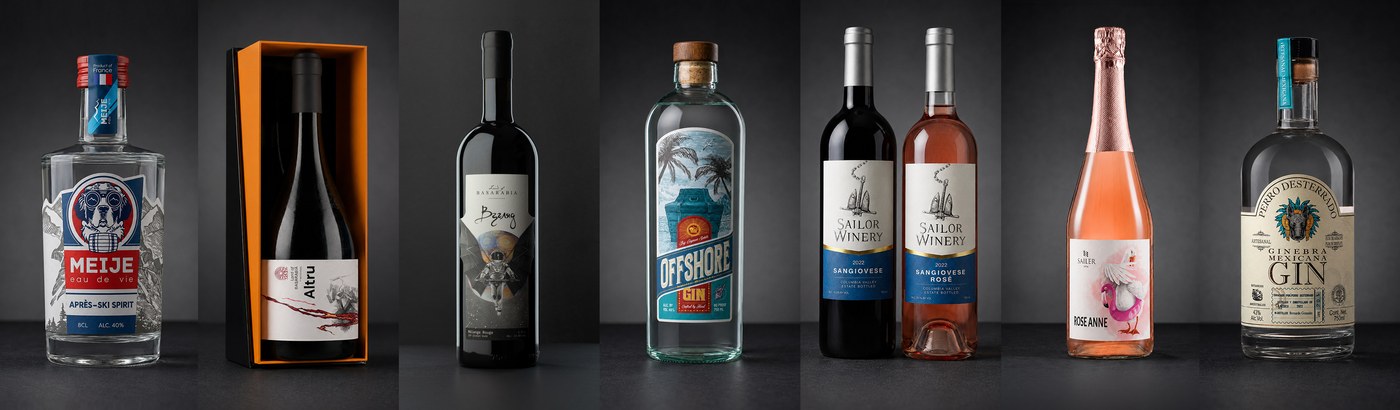
Nine labels for one series in Moldova. An anchor drawn in Oregon in 2018 and still on the bottle. Three birds in Austria. A Mexican gin whose dog became the logo.
On a shelf, nobody tastes
the wine before they buy it.
A wine proves itself after the first sip. Everything before that sip is the label's job — and the label has to earn it from someone who knows nothing about what's inside.
A brewery gets another go: next month's release, a tap handle, a regular who already trusts them. A bottle of wine gets one look, from someone standing in front of two hundred others.
New range, rebrand, first export order, a shelf where every label is a château and a crest — different circumstances, one problem underneath. The character of the wine has to arrive before the cork does.
Don't illustrate the wine.
Illustrate the character behind it.
A varietal tells a buyer almost nothing at the moment of choosing. A character does the work instead. Red John is a confident rooster. Rose Anne is a goose who would rather be a flamingo, pink swim ring and all. The wine stops being a grape and starts being someone you remember.
Something has to stay fixed, and it isn't always the drawing.
For Kosmos it was a colour: grey as the ground under nine different worlds, one accent per bottle. For Sailor Winery it was a mark: one engraved anchor, a gold wave, a blue panel, and a single line of type that changes. For Sailer it was restraint: white space and quiet type, so three birds could each be loud in their own way.
Set that fixed point once and the range keeps its face without every bottle arguing with the last one.
Four producers,
wine and spirits.
A closed series, a label that outlived eight vintages, a drawing that turned into a logo, and three bottles that are sold as characters.
Wine label design and spirits label design run together here for a reason: a Mexican gin, an Alpine eau de vie and a Moldovan Riesling meet the same buyer in the same aisle, and each has to say something before the cap comes off.

Series
Kosmos
Nine labels, one grey language · Land of Basarabia, Moldova

Longevity
Sailor Winery
One drawing since 2018, no redesign · The Dalles, Oregon

Identity
Perro Desterrado
A label drawing that became the logo · Mexico

Character
Sailer
Three bottles, three personalities · Haugsdorf, Austria
Four more wine and spirits projects, not shown above: Altru·Meije·Offshore Gin·Sherwood·everything else
How a label actually gets made
You choose at the start,
not at the end.
The picking happens here, on three rough passes, while changing direction still costs an afternoon. By the time a label looks finished, it is expensive to argue with — so the argument is held early, on purpose.
Same wine, same window, three ways to frame it: a cockpit seen over the console, a wide band of glass, and a pair of ports opening left and right. Each one puts the Earth in a different place and gives the name a different amount of room.
The name moved as well. It was EARTH, then ДОМ, then Casa — English, Russian, Romanian, all of them saying the same word. What changed wasn't the meaning, it was the language. On an export shelf none of the three explains the wine anyway, which is the whole argument for drawing the name instead of setting it. Nobody reads it. They look at it.


One more thing gets decided at this stage, and it isn't the drawing. A wine label is a physical object: the shape it's cut to, the paper it's printed on, whether anything is foiled or raised. Every bottle in the Kosmos series got a die-cut of its own, on a heavy textured stock — so the outline of the paper and the outline of the illustration were drawn against each other, not one after the other. Offshore Gin was drawn to take foil stamping, cold embossing and a die-cut at once.
None of that can be bolted on at the end. The finish decides how much of the drawing survives contact with the bottle, so it belongs in the conversation while the sketch is still rough.
The third direction was chosen. Seven passes later, in order and on a loop: pencil frame, line with the Earth in colour, tone, structure, surface, and the pass that went to print.


What you get.
01
Print-ready files.
PDF, AI and EPS — front and back as a pair, since a bottle rarely carries just one label, with the mandatory text set to the sizes your market requires. Prepared so the printer doesn't come back with questions.
02
Mockups along the way.
A wine label is read through glass and around a curve. Before anything is final you see it on the bottle — what the shoulder cuts off, how the drawing sits against the colour of the wine behind it, what still reads from a metre away.
03
Built to outlive the vintage.
The year, the varietal and the back-label data sit apart from the drawing, so next harvest changes a line of type and nothing else. Sailor Winery's anchor has been on the bottle since 2018 on exactly that arrangement.
Before you ask.
We change vintage every year. Does the label get redrawn?
No. Sailor Winery's anchor was drawn in 2018 and hasn't been redrawn since. Every year the vintage on the front and the data on the back change, and the drawing stays. That's what the first label pays for. The pricing is on the services page.
Does every wine in the range need its own illustration?
Not always. Kosmos got nine drawings because the series was nine separate stories. Sailor's Sangiovese and Sangiovese Rosé share one label with the varietal line swapped — the wine supplies the difference. Which of the two you need is a question about the range, not about the drawing.
Do you work with spirits as well as wine?
Yes. Gin, eau de vie and liqueur sit on this page for a reason: the buying moment is the same. Perro Desterrado is a Mexican craft gin; Meije is an Alpine eau de vie.
We sell at the winery, not on a supermarket shelf. Does that change anything?
Then the label has a different opponent — and yours is the one case where the wine is tasted before it's bought. On a shelf a label competes with two hundred strangers. At the winery the visitor has already met you and the wine, so the label has to survive the drive home and still be memorable on a kitchen table. Sailer was drawn for exactly that.
Who supplies the legal text?
You do. ABV, volume, allergens, importer lines, the regulatory text your market requires, and the barcode — it comes in as copy, not as a layout. I set it into the design so it reads and meets the size rules; the content and its accuracy stay with the producer.
Can we start with one bottle and grow into a range?
Yes, and it happens often. Perro Desterrado was one label — the drawing became the brand's logo and the rest was built around it. Say at the brief whether a range is coming, because that changes what gets built into the file. The three chapters are laid out in the open.
Who draws them
45pixels is one person.
I'm Alex. I trained as a painter — easel painting, drawing, anatomy, composition, the long academic route.
Working in packaging since 2016. You talk to me, not to an account manager — there isn't one.
More about how I workOne bottle, a range,
or the whole brand world.
Three ways in, priced in the open. Tell me what you're bottling and who it has to convince — I'll tell you which chapter it is, and if it isn't a fit, I'll say so.