The middle is the job: a space dog, a witch on a broomstick and an angry peach knocking a helicopter out of the sky over a burning city — all unmistakably from the same place.
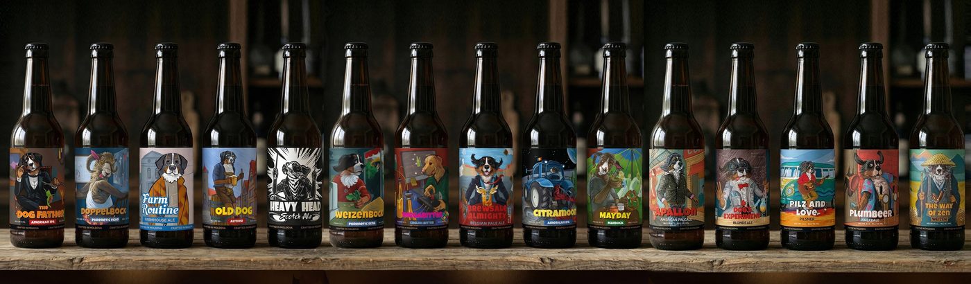
Beer label design.
Craft beer labels, and the system behind them.
Twenty labels for one brewery in Colorado. Sixteen for one dog in Moldova. Six characters in a year for a taproom inside a medieval building in France.
A brewery doesn't need
a label. It needs a cast.
Craft breweries live by the next release. One beautiful label solves this month. The twelfth beer is the problem, and it always arrives.
Hand a full range to most illustrators and you get one of two failures. Every beer looks identical, because the artist has one trick. Or every beer looks like a different brewery, because each brief was chased on its own.
Not a style. A rule.
One fixed point that stays recognisable no matter what it's doing. Everything else is free to move: the palette, the mood, the decade, sometimes the whole technique.
The sixteen labels at the top of this page are woodcut, oil painting, flat vector and comic panel. It's the same dog every time — the owner's own Bernese mountain dog, playing a mafioso, a monk, a scientist, a farmer and a DJ.
Set the rule in the first label and the twelfth costs a fraction of the first. The thinking is already done.
Three craft breweries.
Scale, depth and place — the same rule solving three different problems. Three ways craft beer label design has to hold up once a range starts growing.

Scale
Yampa Valley Brewery
Twenty labels, four lines, Colorado · running since 2017

Depth
Rockscor
Sixteen labels, one character, every style

Place
Rhône Brew
Six characters in a year · Saint-Chef, France
Every beer project on the site is above. The rest of the studio — wine, spirits, coffee, food — is in the full catalogue.
How a label actually gets made
You choose at the start,
not at the end.
Every character comes back as more than one. The Cardinal for Rhône Brew arrived as a gambler and as a treasurer — same animal, same robes, a different man inside.


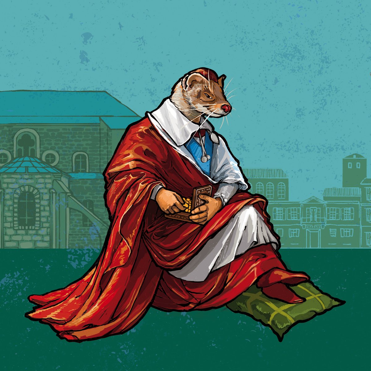
The gambler is the flashier drawing. The brewery took the treasurer.
That call isn't mine to make — and the direction you don't pick is why the drawing can still change later.
Line, colour, town.
The Double Barrel Sheriff for Yampa Valley's barrel-aged series, from the first line to the finished label. Six stages, in order.
What you get.
01
Print-ready files.
PDF, AI and EPS, laid into the dieline you're printing to. A can wrap and a bottle label aren't the same file — the wrap has a seam to meet and the label has a curve to survive. Both prepared so the printer doesn't come back with questions.
02
3D mockups along the way.
A label is never flat. Before anything is final you see it wrapped on the bottle — how the character sits against the curve, what the shoulder hides, what actually reads from a metre away on a shelf.
03
Room for the twelfth beer.
The system says out loud what stays and what moves — the animal, the frame, the colour rule. A new release then costs a new character, not a new brand, and the range still reads as one shelf.
Before you ask.
What happens when the twelfth beer arrives?
That's what the system is for. The first label pays for the rule — the fixed point, the layout, the slot the new drawing goes into. Every release after that reuses it, so a new beer is a new illustration, not a new brand. The pricing is on the services page.
Can one series look different from the rest of our range?
Yes, and it usually should. Yampa Valley's core cans are engraved line work; the barrel-aged series is gothic arches and art-nouveau panels; the one-offs are loud and painted. All three carry the same stag-skull mark. A sub-brand can have its own voice as long as something ties it back.
Cans, bottles, or both?
Both, and they're not the same job. A can is a full wrap — the artwork keeps going around the back. A bottle label is a window with a shoulder above it that hides part of the drawing. Yampa Valley runs both.
Can we start with one label and grow into a system?
Yes. The first one can be drawn as a standalone or as the opening move of a range — say which at the brief, because the second choice changes what gets built into the file. The three chapters are laid out in the open.
Who supplies the legal text?
You do. ABV, volume, allergens, the regulatory lines your market requires, and the barcode — all of it comes from you, and it comes in as copy, not as a layout. I set it into the design so it reads and meets the size rules; the content and its accuracy are the brewery's call.
Do you work with breweries outside Europe?
Yes. Yampa Valley Brewing is in Craig, Colorado, and the range has been running since 2017. Remote work across time zones is the normal case here, not the exception.
Who draws them
45pixels is one person.
I'm Alex. I trained as a painter — easel painting, drawing, anatomy, composition, the long academic route.
Working in packaging since 2016. You talk to me, not to an account manager — there isn't one.
More about how I workOne beer, a full range,
or the whole brand world.
Three ways in, priced in the open. Tell me what you're brewing and what comes after it — I'll tell you which chapter it is, and if it isn't a fit, I'll say so.