ALTRU — Premium Wine Label
Customer: Land of Basarabia/ Task: Label Design and Illustration
Context
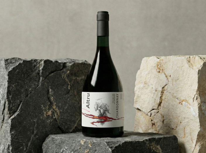
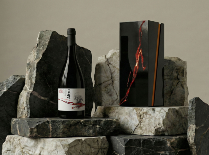
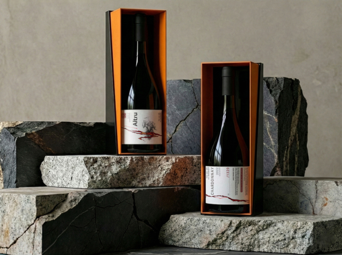
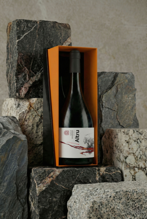
Altru is a limited-edition wine created as a one-off premium release for the Land of Basarabia project.
It is a dry white wine with skin contact, which gives the wine more structure, depth, and weight.
The goal was not to make the label decorative or expressive in an obvious way.
It needed to feel calm, serious, and focused — something that fits a wine made for careful, attentive drinking.
Approach
The idea behind the label is simple.
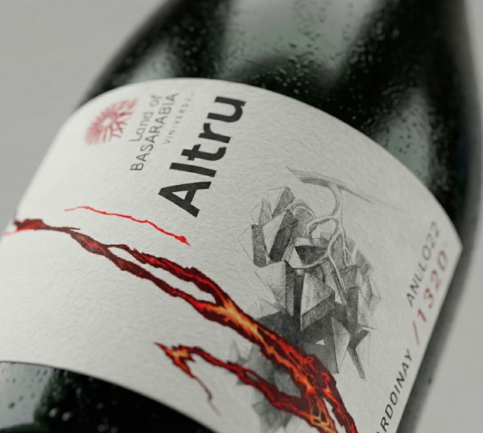
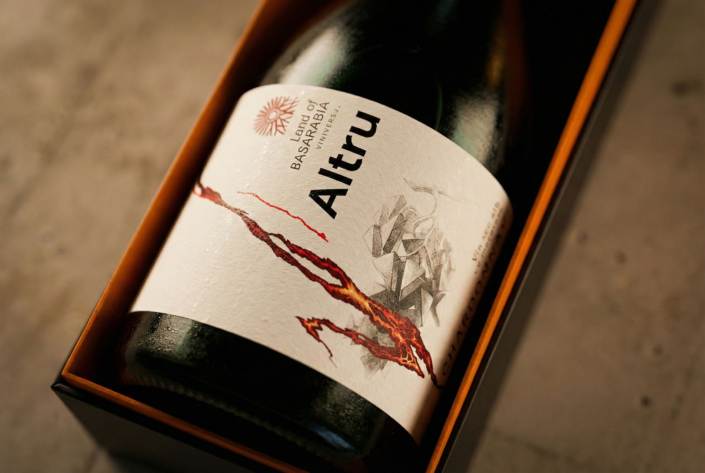
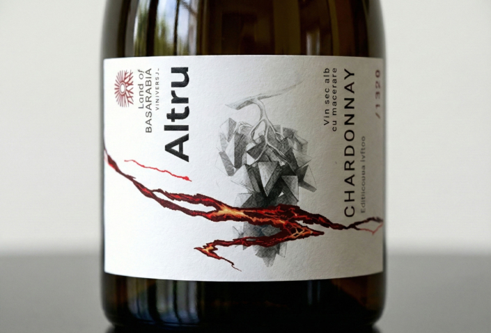
The main graphic element is a fracture.
It stands for pressure and transformation — the kind of tension that builds up during skin-contact winemaking.
Behind it, you can see a grape cluster, reduced to a crystal-like shape.
It hints at the origin of the wine without turning the label into an illustration.
The typography stays clean and quiet, so nothing distracts from the main idea and the label feels balanced and controlled.
Result
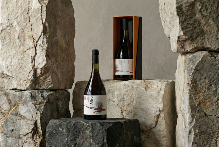
The result is a premium label for a limited-edition wine that feels clear and confident.
The design does not explain too much or try to impress.
It supports the character of the wine and lets the bottle speak for itself.
