Spirits · Full brand identity
Perro Desterrado
— proudly Mexican, not a single cliché
The challenge
Perro Desterrado is a Mexican craft gin built on local botanicals — marigold, avocado leaf, lime, juniper, coriander. The brief was blunt: read as a premium gin instantly, and read as Mexican instantly, without reaching for the usual. No sombrero, no cactus, no skull. Mexican craft spirits have their own clichés by now, and the client wanted none of them.
The face
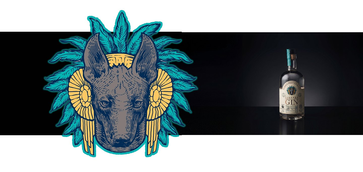
The answer was the Xolo — the Xoloitzcuintli, Mexico's native dog, sacred long before gin existed. Its head sits inside a stylised feather headdress, engraved in the same restrained, vintage line as the rest of the label, arched by the Perro Desterrado wordmark like a coat of arms.
Everything around it stays quiet: classic gin typography, wide open space, a stamp-and-seal system that reads more customs house than costume shop. The Mexican identity doesn't shout from the label. It's earned by one symbol, not decorated with fifteen.
The bottle went on to win Double Gold at the 2021 World Trophy — and the client later built the rest of the brand around the same illustration, not just the label.
The result
Produced, and the bottle went on to win Double Gold at the World Trophy.
The brief was an illustration for a label. What the brand kept was the drawing itself: the feathered Xolo head became their logo, and the rest of the identity was built around it. A label commission turned into a face.

Want one of these
for your own range?
Tell me what you're making and what comes after it. I'll tell you which chapter it is — and if it isn't a fit, I'll say so.